Lawyers need functioning websites like every other client-based profession. But law firm & paralegal websites are held to different standards from their visitors. So what goes into a quality law firm website and how do you build one with a useable experience?
In this post I’ll share design tips with live examples and studies from real law firm websites. I want to break down the primary features that encourage users to interact with a law firm’s website, and take an in-depth look at how these features can be replicated.
And at the end of this post I’ve compiled a list of 50 well-designed law firm websites for creative inspiration.
Before even starting a web design project you want to think about typical visitor behaviors. Ask yourself why people visit legal websites. What are they looking for? There’s multiple answers and your design should ideally solve all of them.
People visiting a law firm website mostly need to learn about the firm. This may be from a corporate standpoint, although most visitors are probably in need of legal counsel and not sure where to turn. These visitors are looking for info like:
With this in mind you want to remember that UX comes before aesthetics. A boring website that works is usually better than a beautiful website that’s confusing and hard to understand.
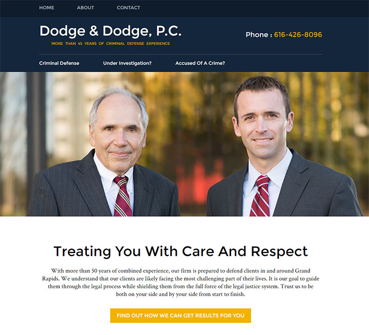
The homepage for Dodge & Dodge is an example of straightforward UX. The links are actionable with big legible text. There’s a phone number clear as day at the top of the page, and a contact form at the bottom of the page.
Navigation links are also simple and easy to understand based on link text. They’re phrased as a question so visitors quickly understand what applies to them.
It’s also worth mentioning that Dodge & Dodge has a fully-responsive website. With more people accessing the web on their smartphones it’s vital for every website to function properly on every device.
A recent US study showed that mobile-only users now exceed desktop-only users which is a big indicator that responsive design is a crucial aspect of good UX design.
Let’s look at another example on the Kim Law Firm homepage. It has more of a punch with the use of vibrant colors and patterns for the navigation. Directly underneath the logo you’ll find phone numbers for contact.
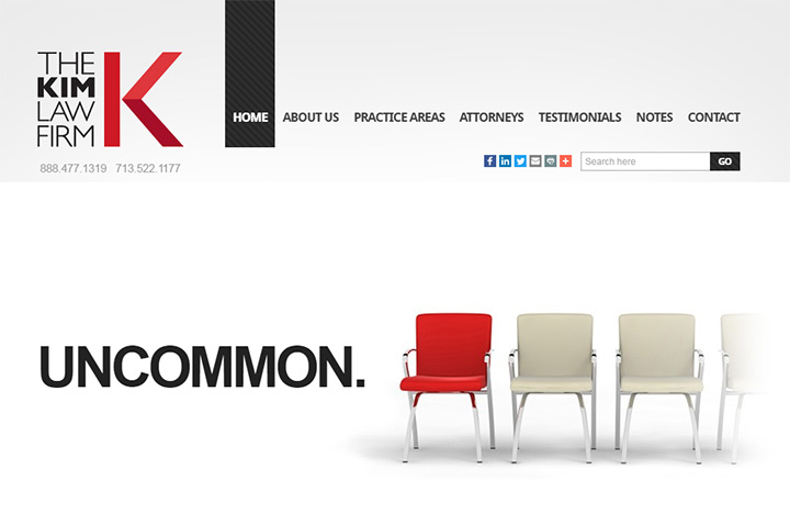
I really like the navigation text in this site. Almost every single link could be valuable to the average visitor. There’s a page explaining the firm’s areas of practice, a page about the lawyers, a page for testimonials and a contact page as well.
However I’m not a big fan of the image slider because it feels like a waste of space.
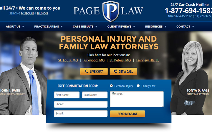
A much better above-the-fold homepage design is Page Law from St. Louis. This design includes a big bright phone number in the top-right corner, plus a consultation form with easy access to first time visitors.
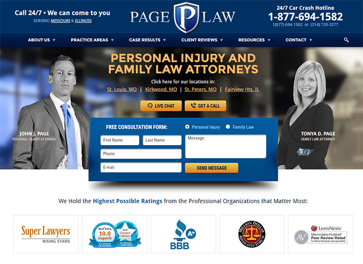
This is considered a call to action, or CTA for short. The form is designed in a way that it’s right in your face and encourages the visitor to take action.
If most visitors look at a law firm’s website to assess their value, the very next step would be to call and setup a consultation. But sometimes people can’t make the call right away, so an e-mail contact form is the next best option.
Page Law takes first time visitors and guides them through the process. The design aesthetics are also incredible; very professional, clean, and well-organized with crisp typography.
But I feel the aesthetics are still secondary to the user experience. Since Page Law has combined both UI design and UX design together, this site is definitely one of the best examples of quality law firm web design.
Plain text on a page is dull and hardly sells anything. It’s worth adding photos to every law firm website, but relevant photos are much better than stock photos.
Try to capture photos of the team and the office. Visitors like to see who represents the law firm and it’s nice to get a sneak peek of the office too(interior or exterior).
If you simply cannot get any decent photos of the team or the office then stock photography can work if it’s high quality. Everyone knows the fake “board meeting” tableau of models posing and smiling in suits. It looks absurd. And that absurdity will rub off on the law firm that decides to use such cheesy stock photography.
I find that stock photos work best when they look like natural professional photos. These photos could capture other lawyer’s offices, courtrooms, legal bookshelves, or anything similar. And you don’t need to be an expert photographer to understand when a photo looks cheesy.
But the absolute worst choice is to add photos that make no sense. The law firm website of Tackett Mull Nicolai demonstrates what bad photos can do to a layout.
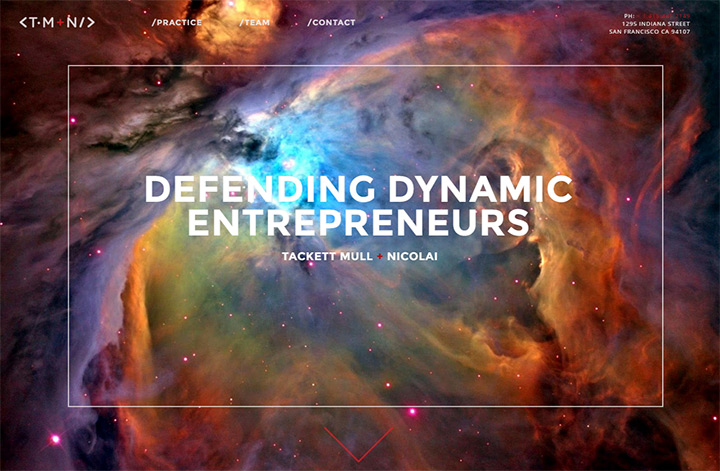
The homepage includes a photo of a nebula which does not relate to law in any way. Plus it doesn’t blend well and makes the text hard to read. Ultimately this photo adds no real value to the website and actually seems to damage the user experience.
On the other hand let’s look at a great example of photography on the Fienman Defense homepage. The attorney Michael Fienman uses a fullscreen photo of himself in court as the background header to his website.
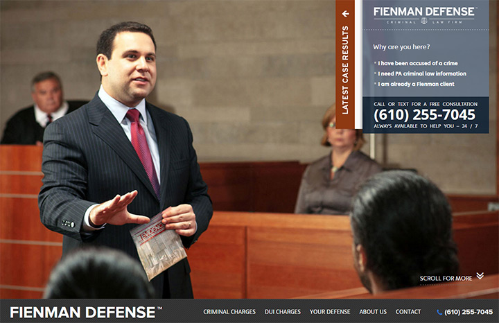
Anyone with halfway-decent vision can tell this is a quality photo. Clear focal point, good balance of lights and shadows, and the pose feels very natural.
I’m not always a fan of the fullscreen background photo because it doesn’t always add to the website. But when first landing on this page you really get to see who Michael Fienman is and what his law firm is all about. That’s what great photography can do.
For a subtler example check out the law firm site of Johnson, Killen & Seiler. The homepage places a greater focus on typography which is very important. But it doesn’t feel dull because the photo falls naturally into alignment with the layout.
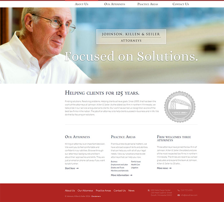
From looking at this page users can interpret what their next step should be. It could obviously work fine without the photo. But the photo adds a small aesthetic to the page making the site much more pleasing to look at.
If you need to find decent stock photos for a law firm website then check out this list of resources. You’ll find dozens of sites in that list, many of which are completely free without attribution like Unsplash and Pexels.
Try to go the free route first and if you can’t find anything then look for premium resources. If you still can’t find anything then it may be worth hiring a local photographer to capture photos for the website.
Written web copy should always be included in the design process. Visitors are looking solely for content, and the way it’s written will make it easier or harder to consume.
The website of Springhouse Solicitors focuses on employment law. Their very first links in the navigation read “employer” and “employee”. People seeking their legal counsel ultimately fall into one of these two areas, so the links capture attention and get people diving into the site.
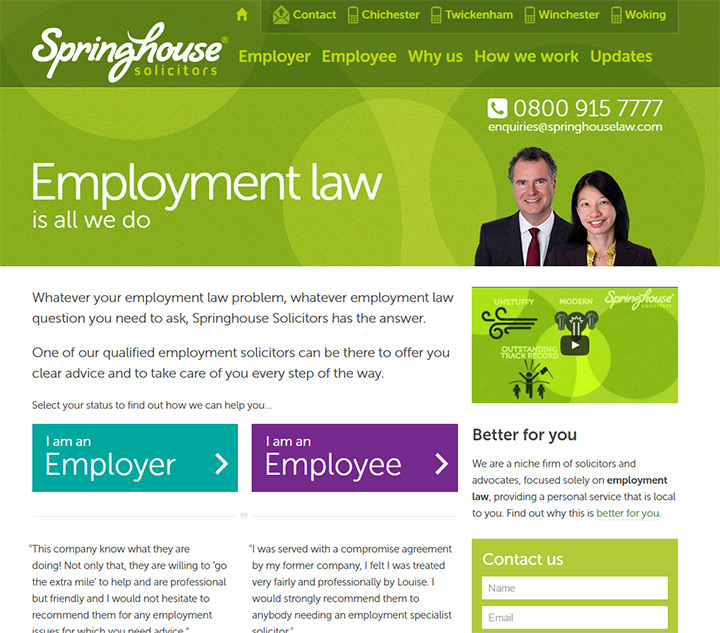
You’ll also notice there are buttons lower in the page with this same text. User behaviors are predictable if you can understand what they need and why they’re on a certain website in the first place.
Ambridge Law follows a similar content strategy with their navigation links. Two different links for “types of accidents” and “types of injuries” include dropdown menus with further links.
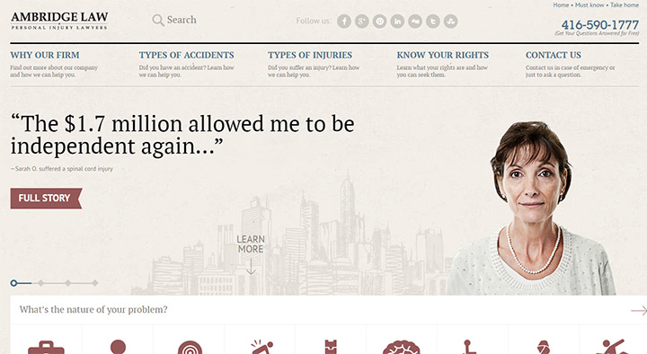
Visitors know where they need to go and what they need to find to get help. Plus there’s a phone number in plain view and an easily-accessible contact page.
Content guides people through a website to find what they need. Good content does this naturally without much effort from the visitor. The best way to write content is to put yourself in the visitor’s headspace and consider what information they need.
Another point about Ambridge is their design aesthetic. Folded corners, dark shadows, and paper textures can be found all over the website. This feels very natural and greatly improves the emotion of the design. Also the site is completely responsive and works great on smartphones.
This is a big point and should be emphasized as much as possible.
Law firms get business from clients. Some are direct referrals who never even see the website.
But many people use Google to find lawyers. So your website’s #1 goal should be coercing each visitor to contact the law firm, ideally turning from just a visitor to a lifelong client.
Offer as many options for contact as possible. Phone is the quickest and most preferred method. But there’s also e-mail and live web chat if applicable. Directions and maps should also be included to help visitors decide if the law firm is close enough for a consultation.
The toughest part can be convincing a visitor who’s on the fence to actually reach out and make that first appointment. Every lawyer’s website should be designed to encourage action.
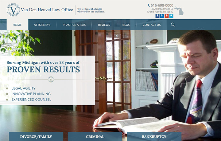
Van Den Heuvel is a typical law firm site following the UX practices I’ve already outlined. Phone number & address can be found right in the header.
But there’s also a vibrant contact form lower on the page near the footer. This makes it super easy for someone to type a quick e-mail and get in touch, even after business hours.
If someone’s browsing the site at 9PM and knows the office is closed, they might not even bother to call and leave a message. Some people might. But others may feel an e-mail is the better way to go.
Offer both and let the visitor decide.
On the topic of footer designs I must commend Crowell Law website for such a great footer layout. Again it offers a typical user experience but there’s a very clear contact form located directly beside a list of office locations & telephone/fax numbers.
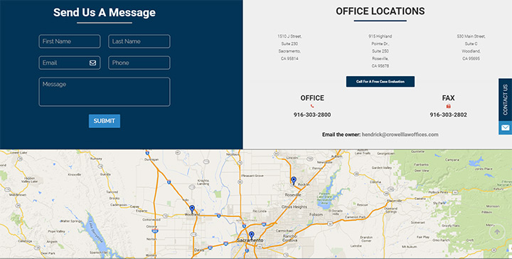
They even have a “contact us” button fixed to the side of the website. It scrolls with the visitor every step of the way. E-mail contact is just one click away on every page of Crowell’s website.
Remember that you want to make contact easy and encouraging. It’s likely that many people are stressed or upset when searching for a lawyer. Make the process as easy as possible, hopefully encouraging visitors to feel better about their decision.
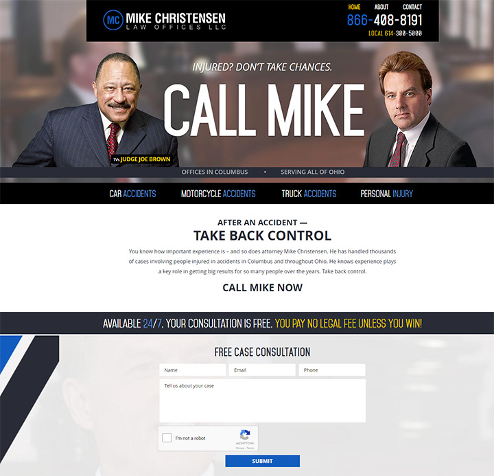
The website for Mike Christensen literally uses a domain with the text Call Mike. This text is also featured in big bold letters on the homepage. It’s telling the visitor what to do and encouraging them to take that first step.
I feel this strategy comes off a little too gimmicky. But I bet it works great and does get people to make that first call. So you really can’t argue with results.
Although it helps that Mike’s website is also incredibly well-designed. Typography varies in tone & color, and there’s a sense of hierarchy over the whole page.
This is how powerful web copy can enhance the user experience. But don’t just take these tips as gospel for law firm design.
Consider why these techniques work and how they could be replicated to fit each project.
Some law firms cover a broad range of areas while others practice in very specific areas. Try to explain and illustrate these differences clearly so visitors know what the firm offers.
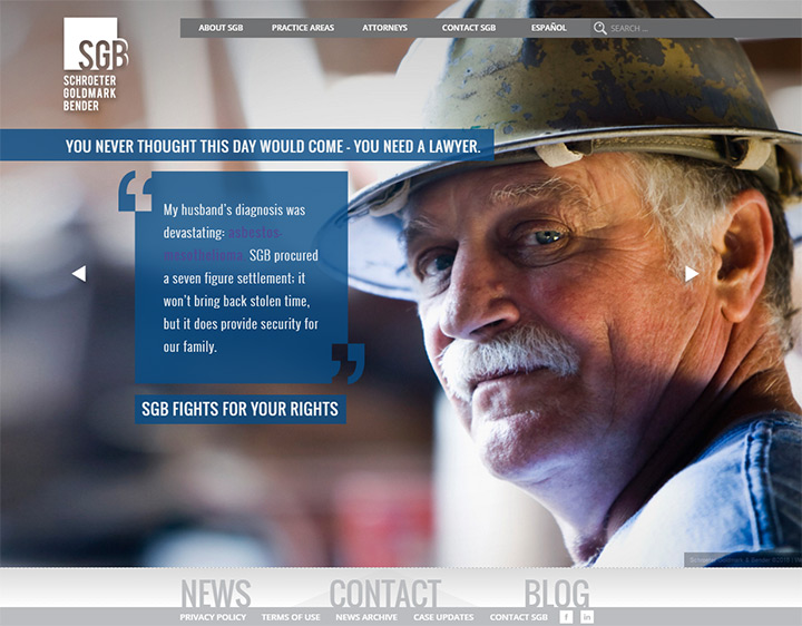
For example this worker’s comp firm has a photo of boots and laborers in the background of the header. This illustrates visually that the firm specializes in worker’s compensation.
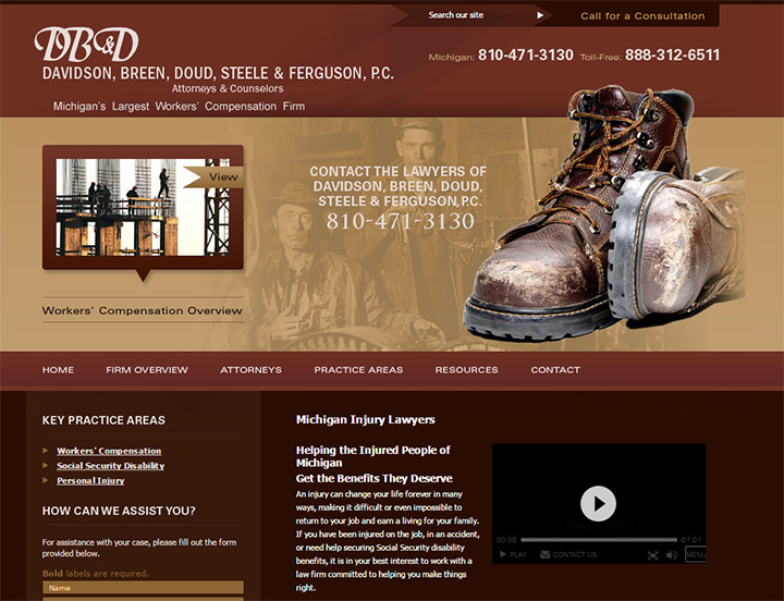
Text under the logo also explains this specialty, along with nav links and other areas of the page. But sometimes visuals are the best way to convey a message quickly.
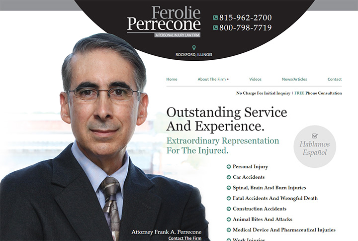
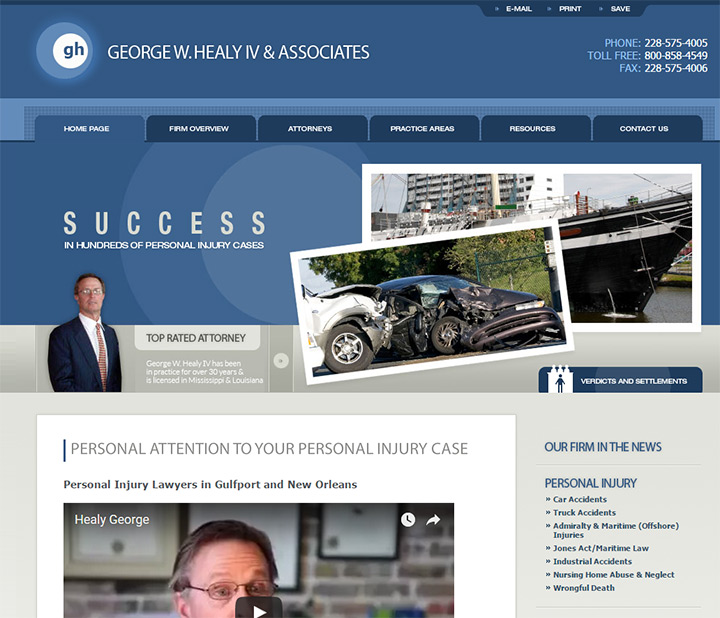
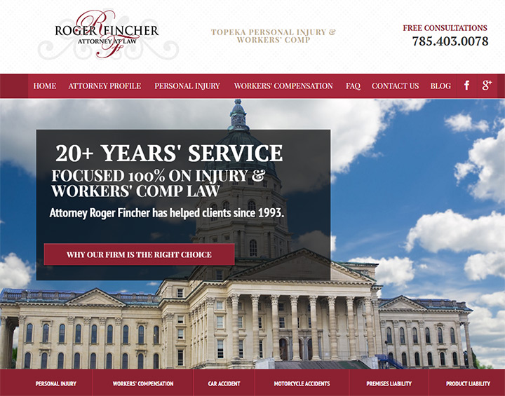
I really like this next example from a personal injury firm in Rockford, IL. The design has all the qualities of a professional legal firm. It uses rich text, attorney photos, and a clear call-to-action helping visitors set up their first appointment.
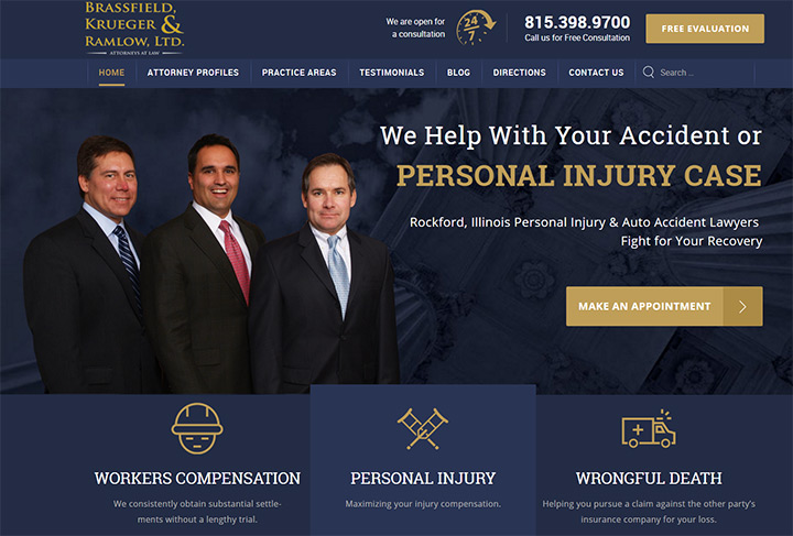
But small subtleties in the design also hint at the firm’s specialty. Yes it’s in the site name. But it’s also in big letters that read “personal injury case”.
You’ll notice small icons denoting three areas of expertise in workers’ compensation, personal injury, and wrongful death. The small graphics aid in delivering a clearer message to the first-time visitor who may be skimming the page for details.
The law office website for John Wallach is also well-designed and very clean. It doesn’t feature as many eye-grabbing areas but it does have stellar typography and a useable interface.
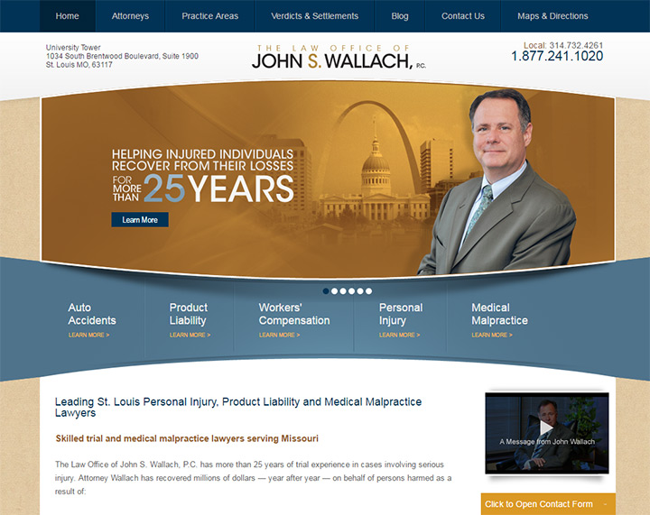
There’s a wide blue band spreading across the entirety of the page. This blue section holds links for areas of practice that John can help with: auto accidents, personal injury, and a few others.
Whether you want your specialties to immediately draw attention or sit quietly on the page, you want to add them somewhere. Visitors don’t expect one lawyer to understand all areas of the legal system. By quickly covering what the firm can help with it saves the visitor time and helps them dig deeper into the content.
I want to stress that not all law firms have to follow the route of powerful branding and professional aesthetics. But typical law office websites have a very particular look, and many people expect this style of design from lawyers.
Professional law firm sites often share many traits like strong colors, simple gradients, high contrast, attorney photos and directly visible information.
This is important because first impressions matter just as much online as they do in person. A law office website should not look like an ice cream parlor or an auto mechanic website. They each serve a different purpose, and a law site aims to connect clients with a serious professional(usually about serious topics).
It helps if you can avoid the generic “template” look but that’s not a deal-breaker. An altered template is usually much better than a poorly-designed custom layout.
For example this firm and this firm have basically the exact same layout, both apparently designed by the same company. This is OK but they’d both benefit if they were more unique.
A great example of this powerful design aesthetic is the law office website of Bryan Stephenson. The color scheme follows a dark/navy blue and a dark/crimson red with high contrast between text colors and background colors.
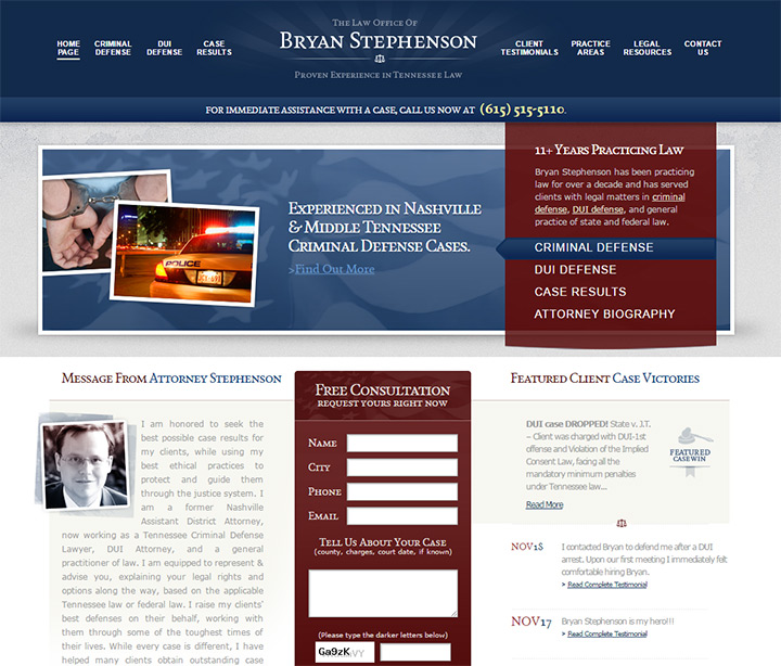
The layout is strikingly rich with minimal textures and gradients. They’re easy to notice, but no single area draws your attention too harshly. And while the design is good, there are some downsides to this site.
Namely that I’m having a hard time finding a specific call to action other than the phone number in the header. Plus it’s not responsive which is appalling in today’s go-go-gadget world.
Rioles Family Law has a less formal layout design but still very professional. It’s a lot simpler with flat colors that draw your eyes toward the center of the page.
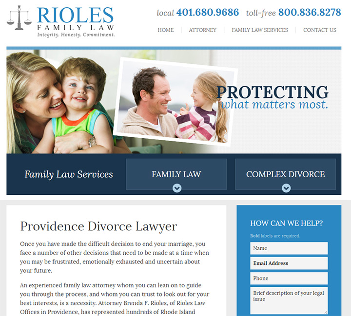
Everything from the dropdown navigation to the contact form is all very predictable. You could almost design a style tile for this site because the aesthetics fit together so nicely.
Professional layouts do not always need boisterous textures and vibrant colors to attract attention. They just need to look like they were designed by someone who understands design principles: composition, white space, typography, symmetry and relationships to other elements on the page.
A good first step is to analyze the predictability of your design(or really any design). Would an average first-time visitor be able to predict how the site works? Is the layout intuitive and easy to start using right after the page finishes loading? The answers will guide you on the right path to a professional web design.
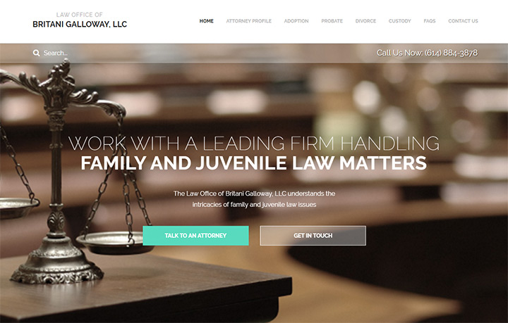
One other example I want to share is the website for Britani Galloway. It’s not perfect and there are some design choices I’m not very fond of like the pageload animations.
But the typography is stunning, both in font choices and font styling. The navbar text is bold, all uppercase, and designed with a set amount of whitespace in mind. The active page link is much darker to emphasize which page is being viewed.
Pay attention to these small details because micro design choices often affect the macro design aesthetics of the project.
Most of the examples I’ve listed in previous sections have the same broad and powerful look. You’ll know it when you see it.
Just keep in mind that other design styles can work just as well. The beauty of web design is finding a solution that works best for the client. On the UX side the answers are often very similar. But on the topic of design aesthetics you have room to branch out, try new ideas, and see what fits best for each project.
Some designers may want to venture out from the usual columned layouts to more unique designs. I’m generally against this unless you have years of experience and a very clear understanding of user experience design principles.
Remember that the visitor’s experience is ultimately the most important facet of any website. The design style and structure can be secondary if it all works.
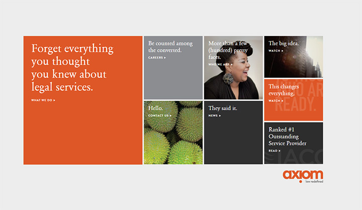
Axiom Law is a good example of a strange-yet-useable website. It relies on a grid structure with navigation links built into different blocks in the grid.
As you browse you’ll find different methods for displaying content. But even internal pages have a very odd feeling to them.
Overall the site works and functions well. It even looks pretty nice and seems like a design that people would want to use.
But it doesn’t feel like the perfect law firm website. Since the target audience is for more technically-inclined people this may be an exception.
Unique design is possible but not always the best choice.
The homepage for Squire Patton Boggs is an example of a decent layout design but very confusing content structure.
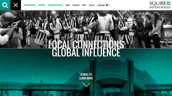
Top navigation links don’t really explain how to browse the site. A visitor wouldn’t find what they’re looking for in the nav text.
In fact there’s no mention of what this company does at all anywhere above the fold. Is this even a law firm? A new visitor would have a difficult time answering that question without scrolling down.
Plus the lower portion of the homepage uses a confusing grid system with random colors, icons, and typography. There’s no rhythm to the page. It all feels fractured and thrown together with the look of a good design, but no real organization or content direction.
This is what you risk by going with a unique design. Sometimes it can pay off. Other times it can look nice but function poorly.
So you have to ask yourself if it’s worth breaking the mold just for creativity’s sake. I always try to match designs to the project, and if the project is a professional law firm that’s probably not the time to experiment with groundbreaking new creative layouts.
So can unique layouts work for law-based websites? Sometimes, yes. But you’re often much better sticking to what works and customizing your design with limitations rather than breaking new ground for the sake of creativity.
Let’s cover the key takeaways for any lawyer or legal firm. The most important concept is that your website needs to be useable before it’s pretty. First think about what you want visitors to do and how they should find information.
Next think about the best ways to provide this information, both in design and written content. From this perspective it’s much easier to work with a designer and create a kick-ass site that actually helps visitors find what they need.
Let’s examine a few more examples before getting to the inspiration gallery.
First is Rossi Law Firm out of New York. Bold logo on the left opposite a clear phone number in bright lettering.
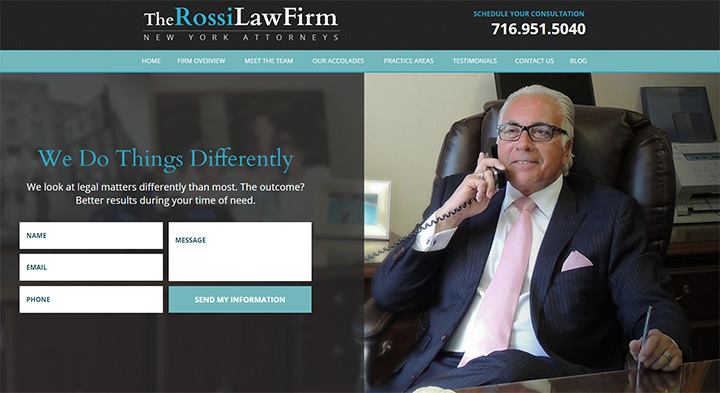
Navigation links are concise and right to the point. The homepage features a quality background photo and a call to action e-mail form. All great stuff.
By placing this form at the top of the page it gets visitors thinking about what they want to do(contact a lawyer) and how they want to do it(by phone or e-mail).
The rest of the homepage includes snippets for the areas of law, client testimonials, awards, and more photos of the office. Rossi Law’s website has a great user experience coupled with professional design aesthetics and it all blends together nicely.
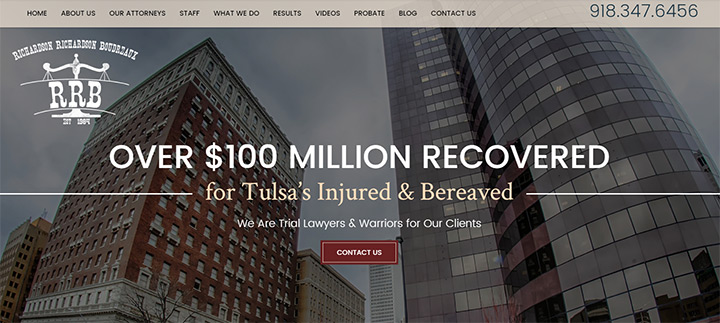
Take a look at another website for a Tulsa-based personal injury law firm. It uses a subtle color scheme with red highlights throughout the page. Red elements tend to jump out and grab your attention, much like the “contact us” button on the homepage.
Lots of variation in typography also draws attention to certain areas of the page. The footer includes a contact form and the top navigation bar stays fixed while you scroll. This way the phone number is always in plain view and easily accessible.
Nice photos, quality typography, and well-designed CTAs all fit the mold of a useable law firm layout.
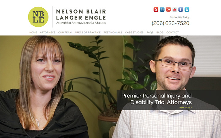
And lastly I’ll quickly cover the NBLE law firm website. This example uses a simplicity of colors and typography to craft a very professional design. The photos feel genuine and the layout feels very honest and natural.
There is no one single way to create an online presence for a legal firm. But there are trends that seem to work well and fit best on these types of websites.
Pay attention to the sites that catch your attention the most and think critically about which aspects draw you further into the site. Learn how to replicate these aspects and you can quickly improve the online presence of any small town lawyer or big city law firm.
All of these tips and trends offer great advice for designers. But they make more sense with examples to see how they work in the real world.
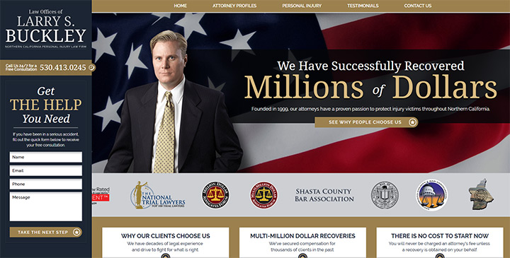
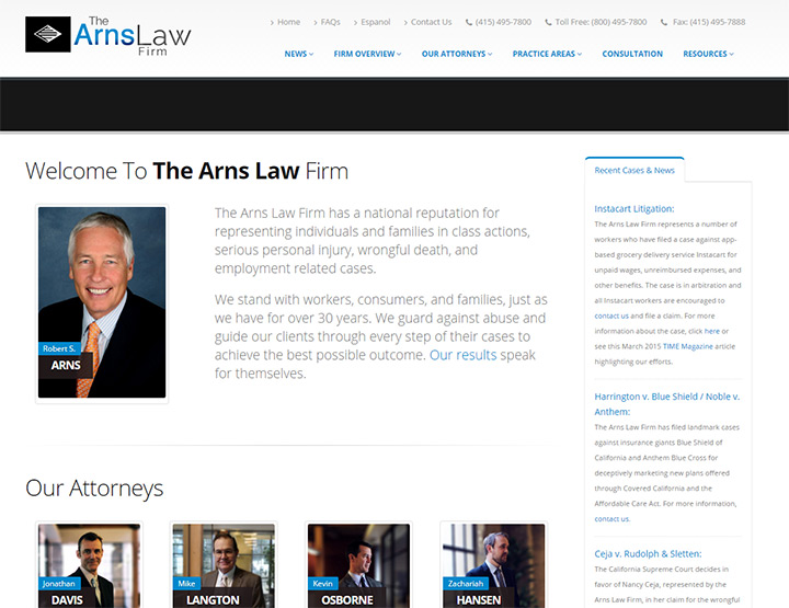
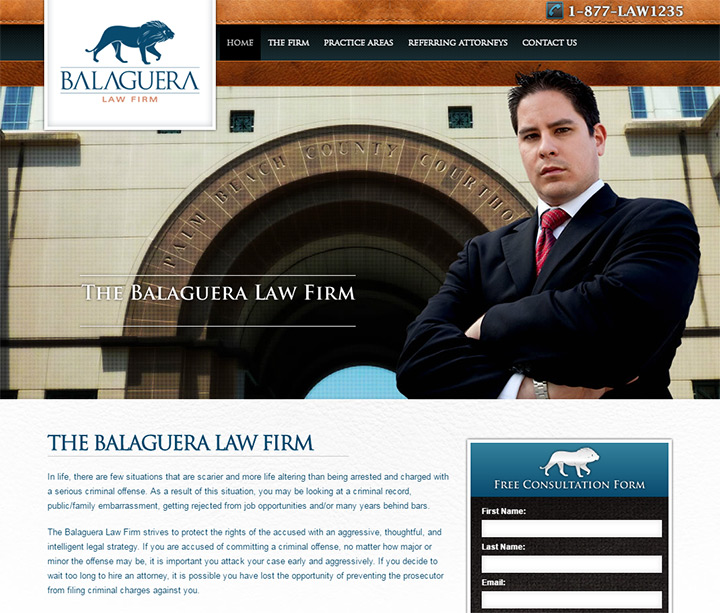
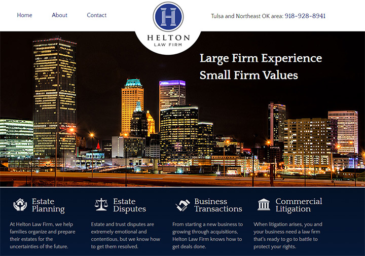
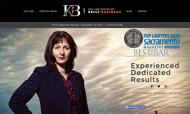
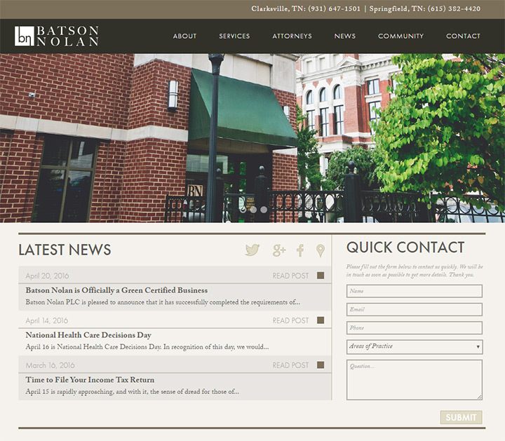
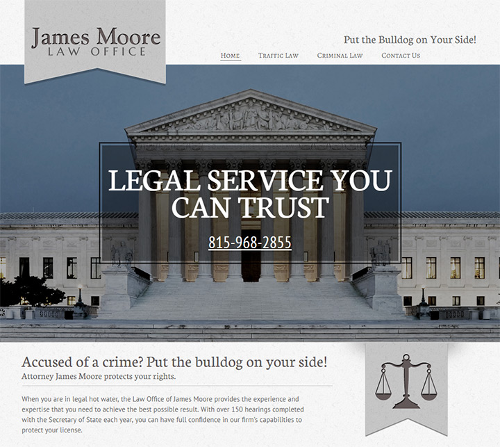
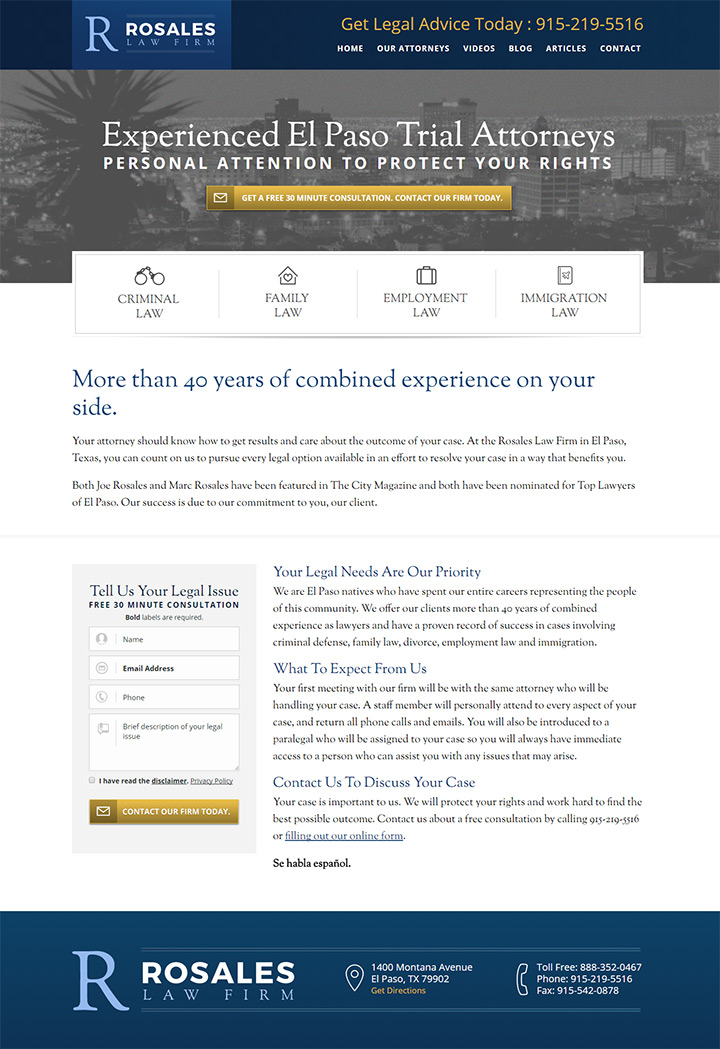
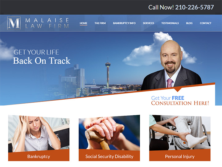
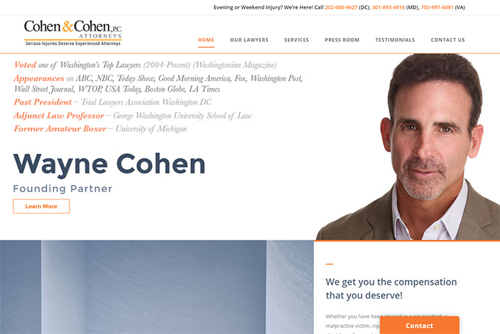
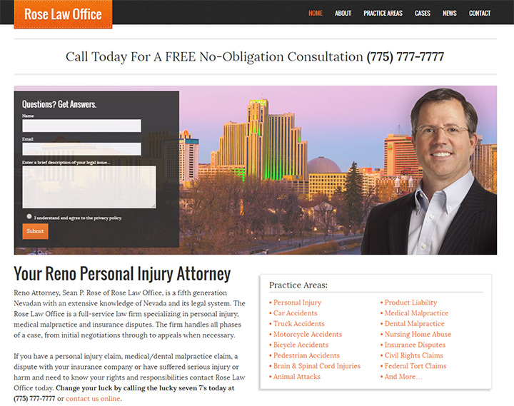
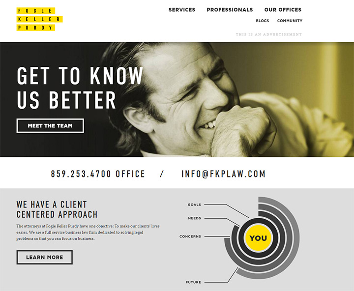
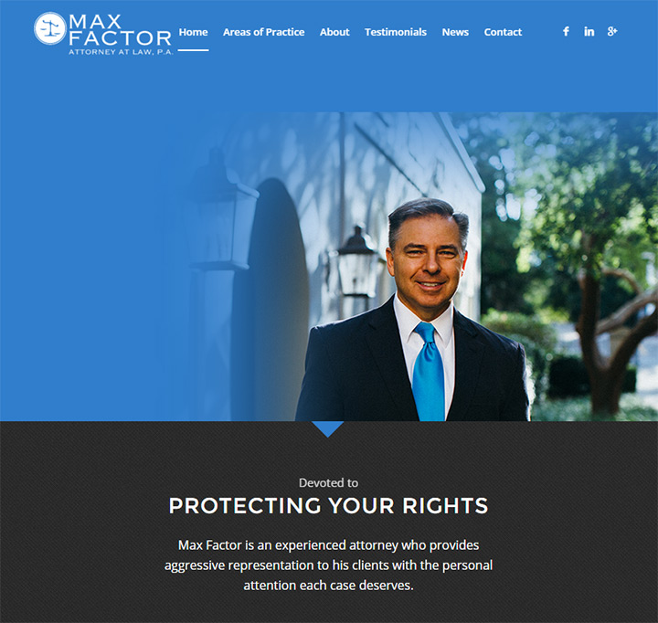
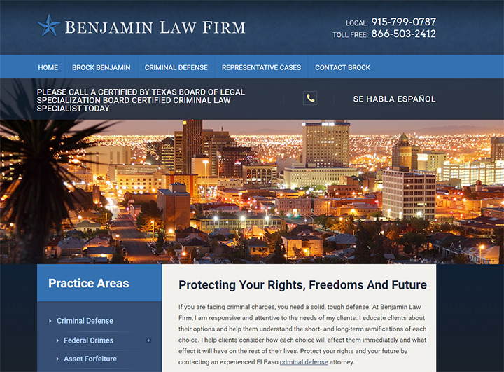
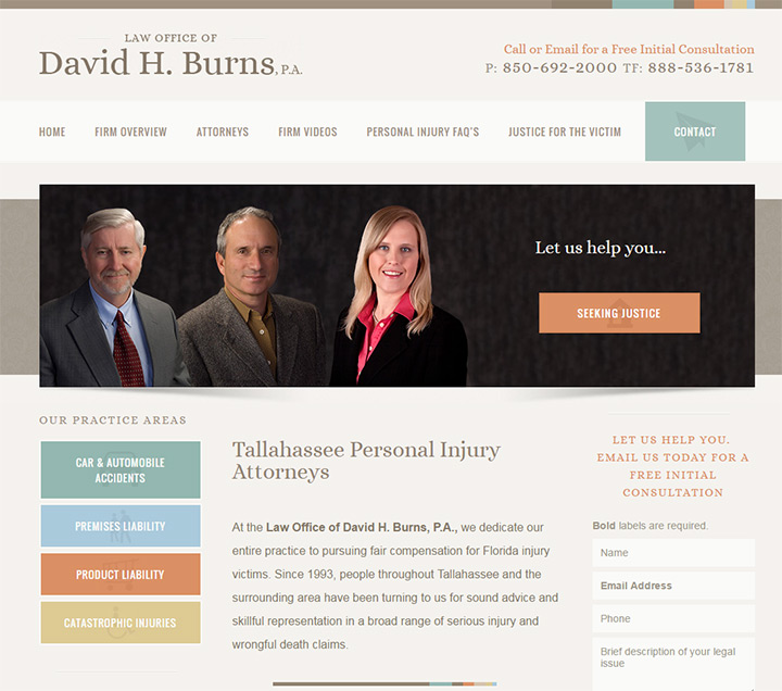
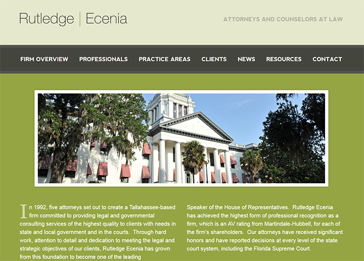
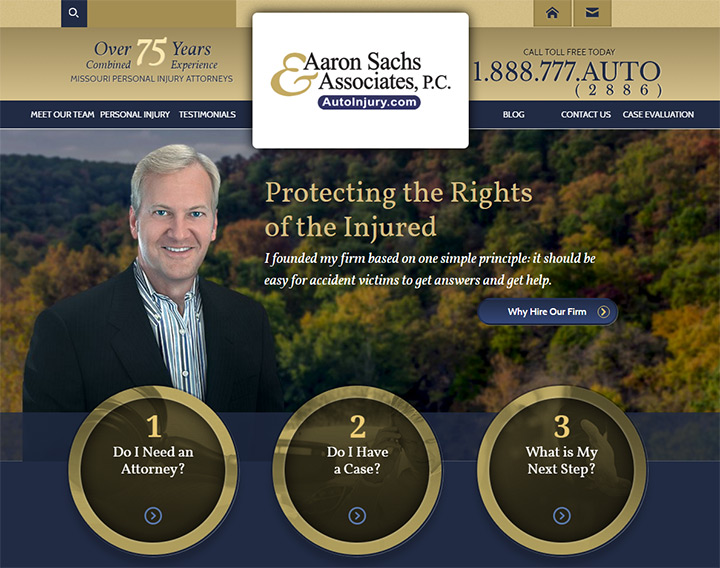
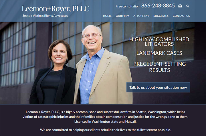
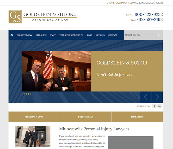
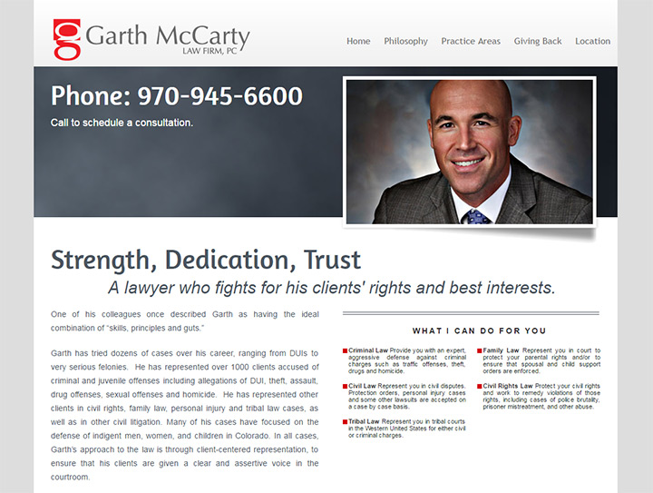
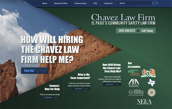
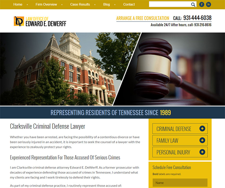
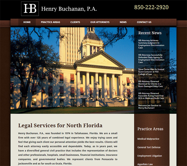
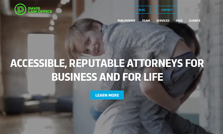
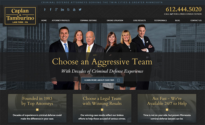
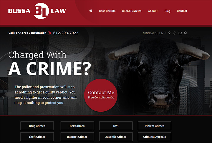
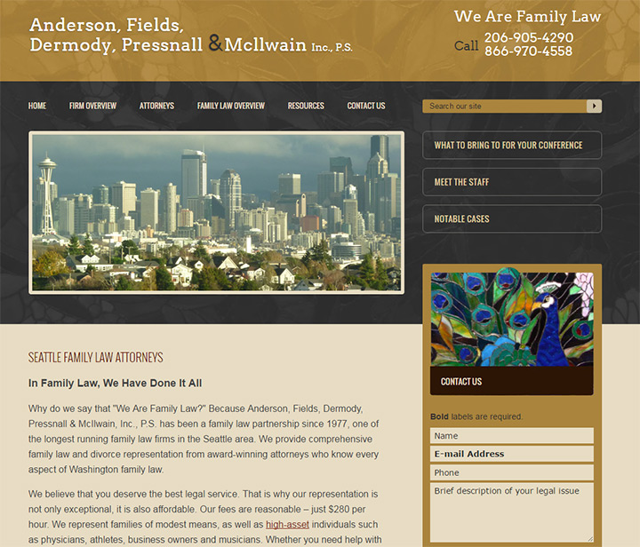
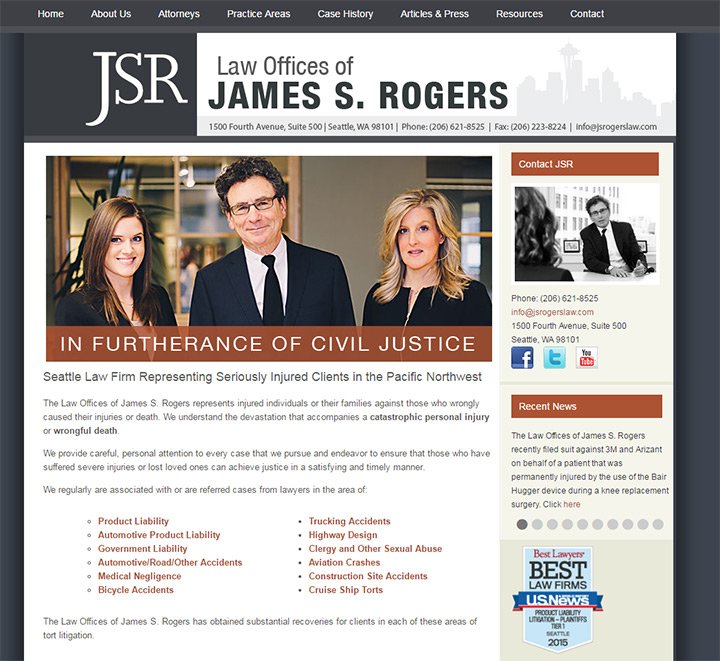
This gallery includes 50 website designs from personal lawyers to very large law firms. Many UX concepts remain the same and you can learn a lot by studying the great design principles found in these layouts.


Jaime is a jr. designer interested in mobile UI/UX research and frontend web development with JavaScript frameworks. He covers general news and useful resources in the web design space.