In 2009 Microsoft got into the realm of search with Bing. The incipient logo was somewhat cheesy but lovable.
Then in 2013 MS published a drastic redesign changing the text style, adding a polygon shape and forcing a solid yellow color.
Now in 2016 it seems Microsoft is gearing up for more logo changes. The solid yellow text will be updated to green and the iconic Bing logo gets a slight update.
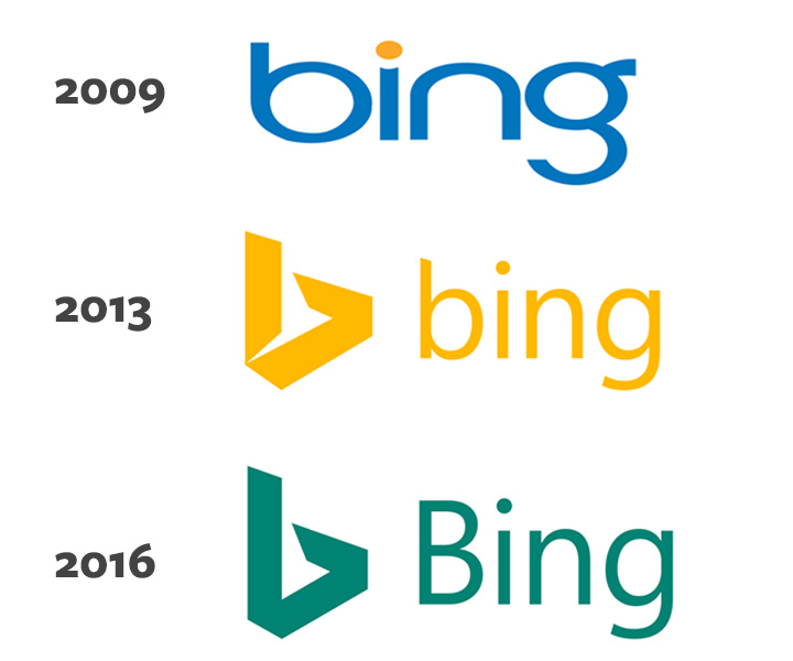
After skimming this Verge post I recognized that the 2013 logo had a flying bird shape in the negative space. It seems the newer update has removed the bird’s tail. Why? Because Microsoft.
Actually my honest answer is that Microsoft likely wants to firm up their logo. By reducing that extra space it gives the polygon shape a more solid feeling, like the shift to a darker green color. The word “Bing” also has a capital “B” for the first time since its inception.
So what does this mean for Bing users? Not too much.
But it’s nice to see that Microsoft is still working to compete with Google’s search monopoly.
Below is a fullsize preview of the new 2016 Bing logo. Just click the thumbnail if you want to see the hi-res version.
![]()
Jaime is a jr. designer interested in mobile UI/UX research and frontend web development with JavaScript frameworks. He covers general news and useful resources in the web design space.