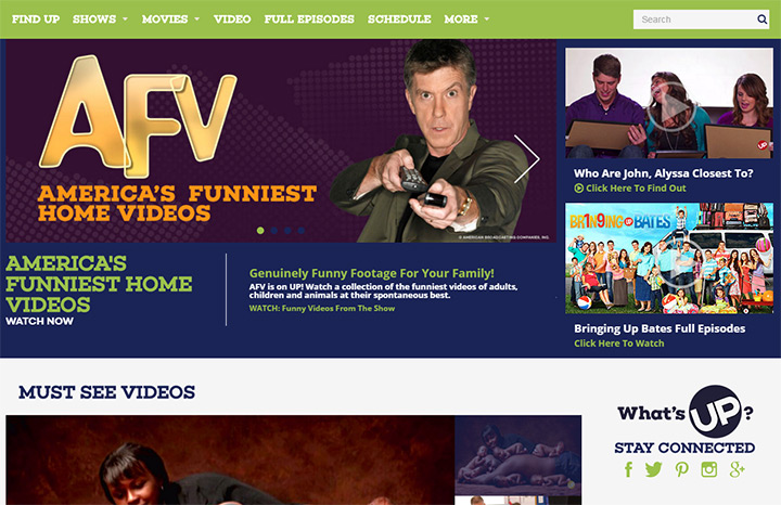
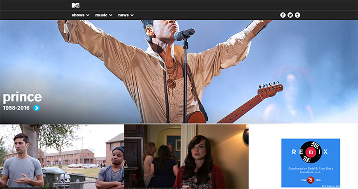
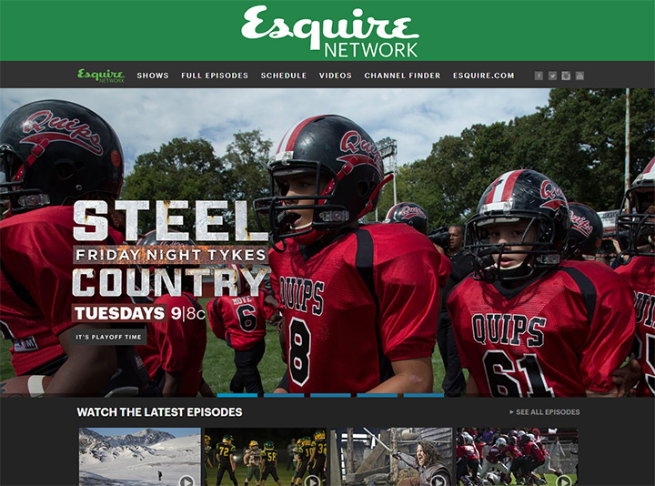
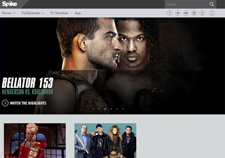
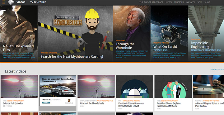
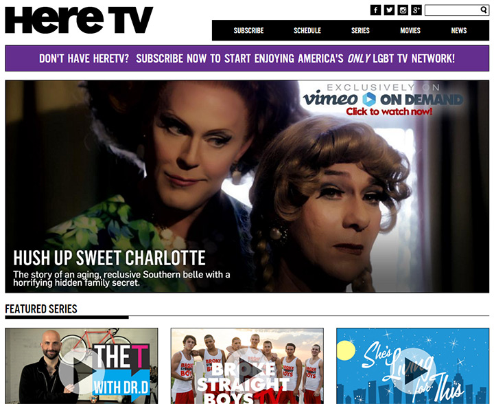
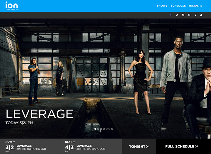
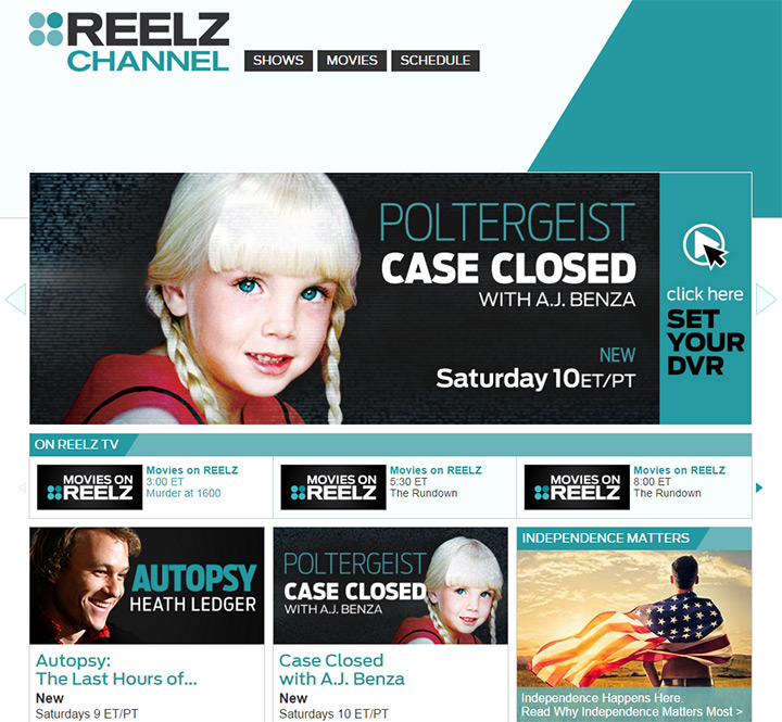
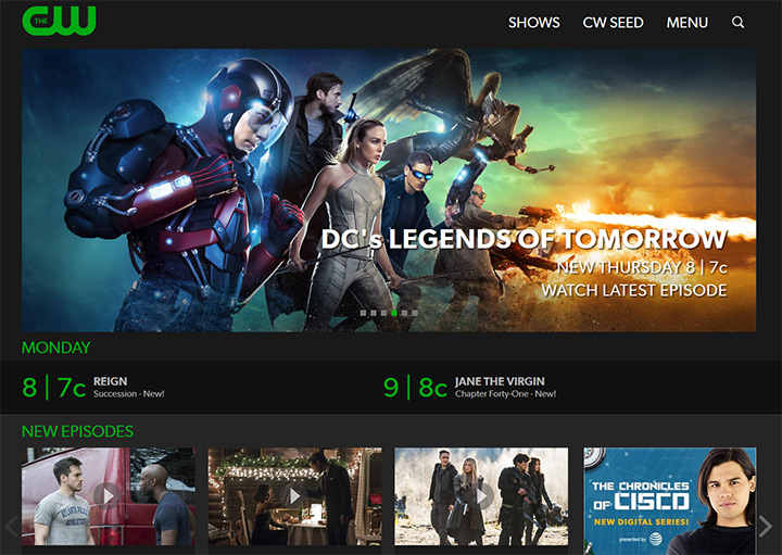
Television was considered the killer of radio and is now a staple for home entertainment. Aside from streaming services like Netflix, most television shows air over a broadcast network. These TV networks are either free for all or accessible through a cable subscription.
Over the years we’ve seen a dramatic increase in the number and diversity of TV channels. Every good channel also has its own web presence, and in this post I’d like to explore the design techniques of a good TV network/studio website.
I’ll cover trends and best practices by studying examples of real TV network website designs. And while these examples focus specifically on television, many of these ideas can be extrapolated to radio network and movie studio websites as well.
Every corporate website in existence serves one primary goal: to help customers and consumers find information. This information might be product prices, consultation hours, contact info… the needs vary wildly between visitors and industries.
In the television industry you get people visiting network websites with very specific goals. Here are some of the most common:
These are all very common needs that don’t require complex page layouts. Network websites don’t need detailed navigation menus because most of the pages focus on TV shows and the schedules that surround them.
Some people may also visit a network website to check support for a particular cable provider. But that information is more useful on the cable provider’s website because it varies by region. So it may be worth setting up a webpage telling visitors to check with their cable provider for network support.
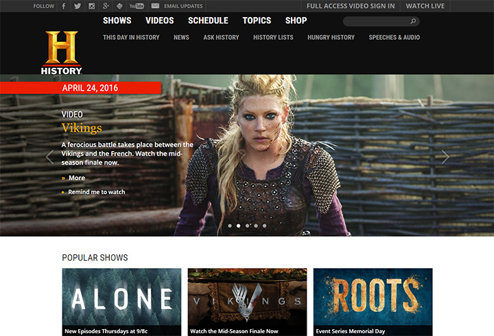
Let’s take a look at the History Channel website. History is a big brand so it covers more than just a network channel, but the navigation makes it super easy to find information.
Shows, videos, and schedules are the very first links in big bold letters. This is considered a vital component of History’s content and these links highlight a majority of each visitor’s needs.
But there’s also lots of extra content to drive people further into the site. The page for this day in history is very cool because it’s actually interesting and it blends naturally with the network’s content strategy.
There’s also a small blog titled Ask History along with world news updates, a verified source of current breaking news relevant to history buffs.
People may come for the TV schedule but they’ll stay because there’s so much to do on History.com. Not every network site needs this extra content. But each site does need to include fundamental info for TV shows and daily lineups.

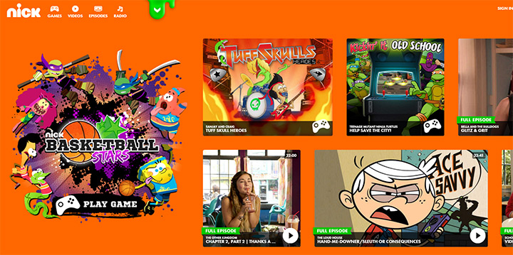
I think the Disney Channel does an excellent job with content organization on their website. Disney as a company has a lot of different brands. Their navigation is still surprisingly clean with ornate design styles for links and content.
Each TV show is listed in the top-right corner with a character from the show used in place of the title. Also the schedule falls just below a homepage slider, so it doesn’t feature prominently in the Disney Channel nav menu.
As you scroll you’ll find different sections of the page devoted to games, video clips, all shows and behind-the-scenes extras.
Disney runs many different channels and each site follows a similar structure with slight layout adjustments. For example Disney XD has an identical header & navigation but the content is styled much differently.
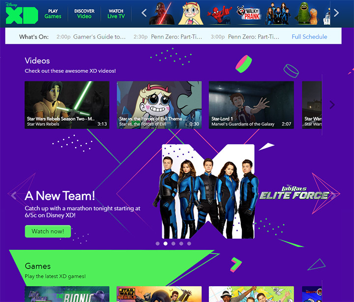
The non-traditional UX choices for Disney’s website lends itself to a younger audience. Different networks can mix up the design and the specifics of how the page is laid out, so long as the content is accessible.
You certainly want to capture attention but flashy design shouldn’t trump user experience.
Ultimately you should combine UI and UX to find the real meaning of the word “design”—the marriage of functionality and aesthetics.
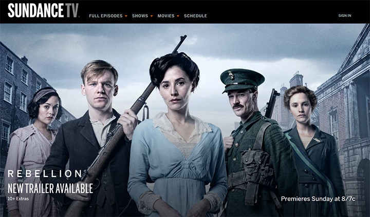
Sundance TV has a very traditional network website. The fullscreen photo is popular because it’s promotional and catchy at the same time.
New visitors immediately recognize the photo and may want to learn more about the show. Sundance uses a simple dropdown menu with all the staples I previously outlined: list of TV shows, current TV schedule, and online streaming.
The rest of the homepage works as a promotional tool for drawing visitors further towards the content produced by Sundance. If the network has a lot of content this is undoubtedly a great design choice.
Just remember the importance of usability and you should be fine with any style of website. But if you’re concerned about your lack of creativity it’s fine to sample ideas from other designs and mix them together into a new layout.
TV networks are empty husks without content. Visitors care most about the different shows on a network, so it’s important to design a website with a focus on the shows.
A good place to start is with the homepage. How many shows should appear on the homepage and in what order? Should newer shows take priority over current shows? Should new episodes be listed near the top? The answers vary between networks and there isn’t any single correct answer.
Take a look at the Comedy Central site which in my opinion is the best modern TV network website. Their homepage lists video clips and upcoming episodes but places a lot of focus on the top image slideshow.
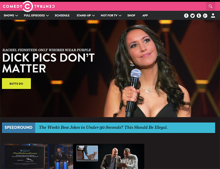
Sometimes this rotates through content while other times it remains fixed on a single panel. The slideshow will spotlight upcoming episodes and season premieres for shows on Comedy Central. Each photo includes some text with a link to a TV show page with more info.
By offering free clips along with new releases it makes promotion a lot easier. Visitors can browse through clips if they see something that catches their attention, and this may turn a random visitor into a fan of an upcoming TV show.
It’s always best to use photos from the TV episodes or promotional photos from photoshoots made for advertising. Photo media is the quickest means to bring people further into the website and hopefully convert them over to watching more shows on the network.
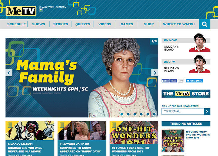
MeTV is another network that uses a much more traditional design. It still features a homepage slider, but more information is crammed above the fold making it easier to access.
Their content slider mixes lots of content together like TV shows in syndication, items from the MeTV shop, and fun TV-related quizzes. These little features draw people further into the site. They may not solve a user’s problem, but they help build lifelong fans of the network.
Just remember a TV network is nothing without content. Some channels like MeTV only run syndicated shows while others like Comedy Central offer a mix of original + syndication. Different content strategies need different marketing strategies but in both scenarios the TV shows are the focus and this should be reflected in the website.
Before the 2000s there was something called the TV Guide which was a print book containing TV schedules. Hopefully most readers already know that, because if not I’m getting way too old.
By the 2000s advancements in cable broadcasting allowed people to browse the television lineup with an on-screen guide. This is naturally much easier and much more common nowadays. But even with this technology it’s still a good idea to keep the network schedule on the website too.
Some visitors may not have a specific channel and might want to know what types of shows are in the schedule. Other visitors may be on their smartphone in the doctor’s office trying to see what time they need to be home for American Idol.
Whether you feel it’s of immediate value or not, every network website should include a lineup of the current schedule in a layout that’s easy to read and easy to access.
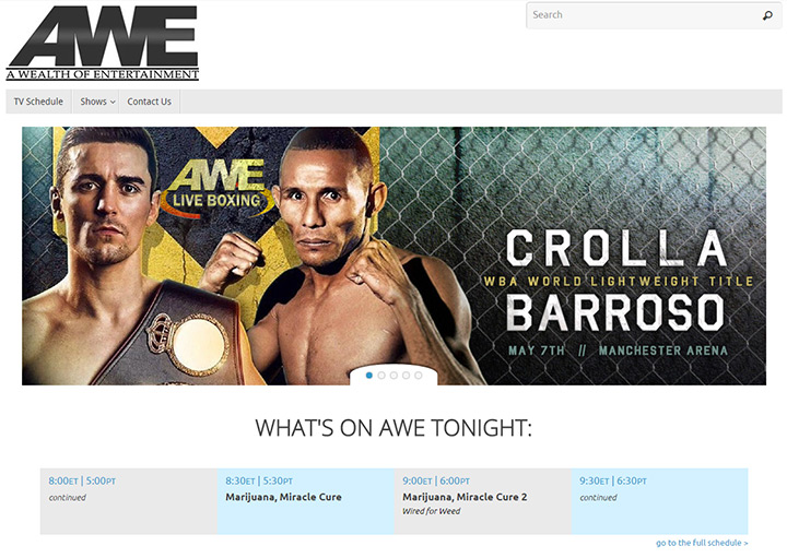
On the homepage for AWE you’ll find a direct nav link to the TV schedule. This page lists everything airing for the next week and includes the previous day’s schedule.
But on the homepage itself is a small preview of the current schedule. There’s a small widget titled “What’s on AWE tonight” listing shows in the primetime slots. A very nice feature for visitors who just want schedule info at-a-glance without browsing through the website.
I personally like the Cinemax website design a lot more because it combines branded identity design with a useable interface.
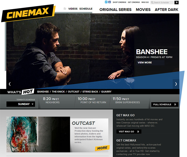
The Cinemax homepage also has a small section for TV shows airing the current evening with a link to the full schedule. Users can even select from a dropdown menu to choose which day of the week they want to view.
But the full schedule page is even better, utilizing a classic grid design. Optional features are available to sort by time of day, station, and view style(grid or list).
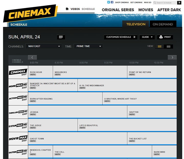
I’m partial to the grid format with TV scheduling because it’s orderly and easy to follow. These grid schedules are predictable which makes them intuitive and easy to understand without instruction.
However there’s no correct answer and the only way to get it wrong is to not include a schedule at all.
Since video content is what makes a network so great, it should make sense to offer previews of the content to entice visitors. Online streaming video was a pipe dream decades ago. But the modern era allows secure HD video streaming quickly to anywhere in the world(with decent Internet speeds).
The best TV networks are using this technology to their advantage by capturing interest from new visitors.
Offer small clips from recent episodes or upcoming episodes. Create promo content with video clips and mashups from current shows. Give visitors a taste of your shows and let them decide if they might want to watch a new upcoming sitcom or documentary.
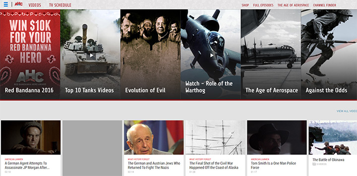
American Heroes Channel places a fullscreen slider on the homepage with dozens of content tabs. Each tab links to a different page in the site with a video player already queued and ready to stream.
The entire rest of the homepage uses thumbnail grids to promote clips from documentaries and other TV shows. Aside from the top navigation, the homepage for AHC is basically a funnel for video content.
Since television is made up of video content, I’d argue this is a solid design and marketing strategy.
The Food Network has much more content because it offers recipes, news, book reviews, and other formats on top of video. But the homepage still links to their videos page while rotating TV show clips in the homepage slider.
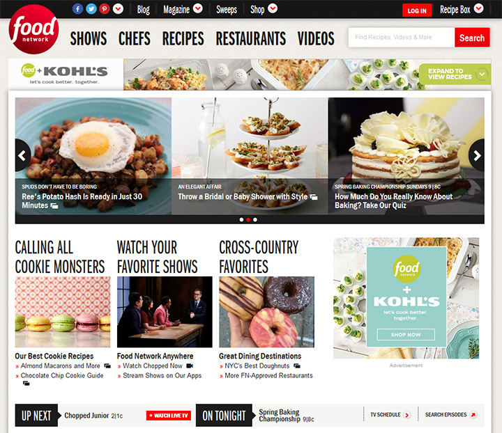
I’d compare Food Network to the History Channel because the brand has grown to produce content far beyond televised entertainment. This means a diverse homepage is a much better strategy because it gets visitors acquainted with the other assets produced by Food Network.
But even with blog posts and restaurant reviews you’ll still find a TV schedule widget and small video clips in the sidebar of every page.
Videos should be a very big part of the website’s content. But if blogging makes sense then that’s another option to attract visitors and build credibility for the network.
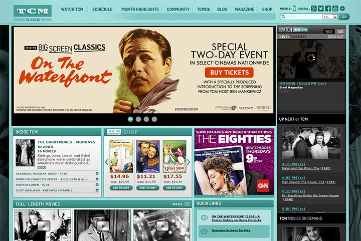
Turner Classic Movies is a well-known branded network but they still run a separate blog, an online shop and a print magazine. Diversification is OK and even makes sense for larger brands.
Just remember to keep a good focus on videos and TV programming. The amount of focus you give to video clips can vary based on the audience and size of the network. But it’s always worth including a clips page because the promotional benefits far outweigh the costs & work requirements.
Not every network site can utilize extra features but they go a long way towards building a consistent audience.
Think of extras as ancillary stuff to the main TV/video content. MeTV has quizzes and cool blog posts like Saturday morning cartoon lineups. This content is not directly related to MeTV, but it’s related to their genre of programming. And since it’s hosted on their website it helps build brand recognition and keeps visitors on the site for longer.
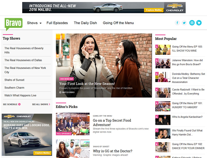
Bravo is a very popular lifestyle/culture network. Their website acts as a TV network portal and a content publisher.
They run a small blog called The Daily Dish which runs on the main Bravo TV domain. This is a good idea because any content posted to Bravo’s website will be more trusted by Google and by readers who recognize the Bravo brand.
On the homepage you’ll notice a list of popular blog posts along with editor’s picks for cool videos & posts worth reading. It’s still easy to find a list of shows and the TV schedule, but these pages do not take primary focus.
Given enough time some visitors may come to Bravo’s website solely for news. This can attract a new audience of people who know Bravo as a website rather than a TV channel.
Alternatively you can add games and mobile apps in the same manner as Cartoon Network. Since their target audience is generally under 18 there are going to be limits on conversions and product sales.
But the site uses games and apps for promoting Cartoon Network exclusives. Most of these are completely free so they work well for promotional branding.
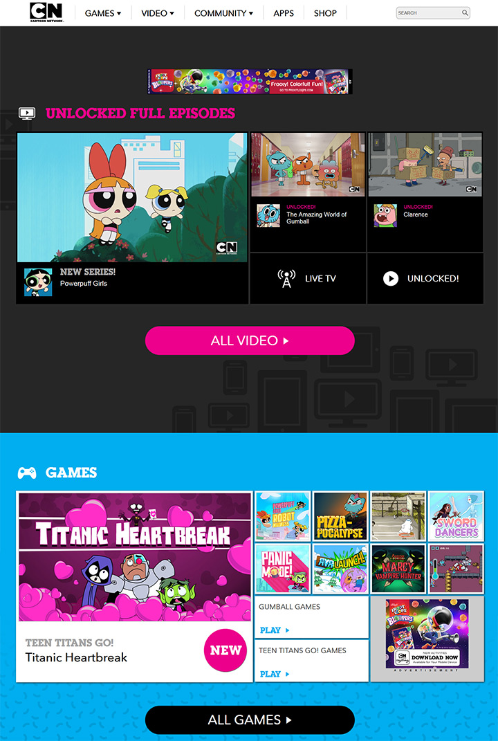
In fact, the top navigation menu on CN’s website has games as the very first link. Other pages lead to app promotions for games developed by Cartoon Network. This can provide a revenue stream for premium app sales or in-app purchases, which diversifies revenue into content aside from television broadcasting.
The sister website Boomerang also has games, web comics, and sometimes giveaways for lucky individuals. These extras work best with a young audience but they demonstrate the power of adding extra content to a TV network website.
Each situation will be different but it’s worth considering the options. Almost every network could use a blog or news page. If that could be valuable then it’s worth adding some text-based content onto the homepage along with videos.
Anyone familiar with marketing understands the importance of branding. It creates instant recognition with a website and draws people towards a certain brand wherever it’s seen.
The importance of network branding is also crucial because the company’s logo will appear as an on-screen watermark. It also appears in network IDs for the channel.
In the world of web design great branding equates to a powerful logo on the site, but should also permeate through the entire webpage to leave a lasting impression on the visitor.
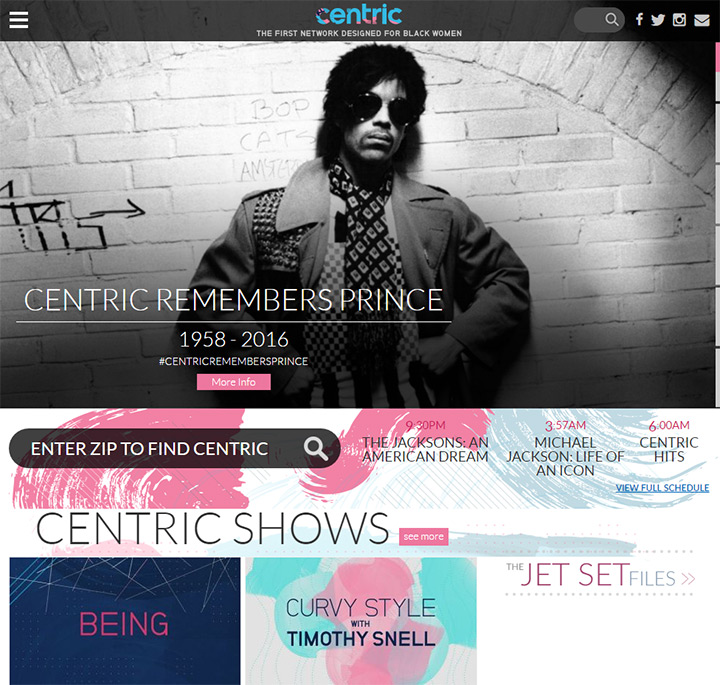
Centric TV keeps their logo fixed to the top of the site and it follows as you move down the page. It uses a mix of blue/pink colors and really stands out from simpler network logos.
Directly underneath the logo you’ll find a small descriptive blurb about the network. It reads “the first network designed for black women” and this also stays fixed as you scroll. Some visitors may not even know about Centric because it’s not as popular as the big stations like CBS or NBC.
With a clear and recognizable branding it’s more likely that visitors will remember Centric even after the first visit. Branding clarifies the product(s) & vision of a company by using visuals and text to convey a brief message.
A great logo is crucial because it takes time for a logo to invoke a memorable experience.
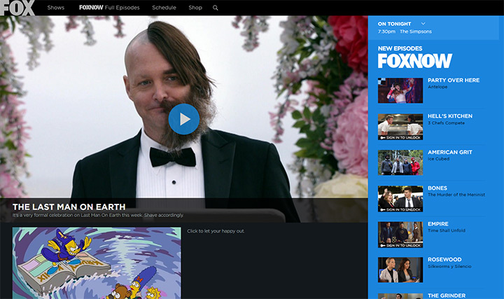
For example the FOX website is incredibly well-designed and very unique in appearance. This is to be expected since FOX has been around for decades(founded in 1986 to be exact).
Their logo is instantly recognized by the vast majority of Americans from all age groups. The logo also stays fixed to the top bar while scrolling, and it’s even used with FoxNow which is their online streaming service.
Everything else on the site is to be expected and it all wraps nicely into the brand. You’ll find current shows, schedules, upcoming new episodes and of course video clips.
Your goals with branding should fall into two categories:
Take a look at the Adult Swim website. This isn’t a unique TV channel, but rather a programming block on Cartoon Network. Yet it’s popular enough to have its own site with its own unique outlandish branding.
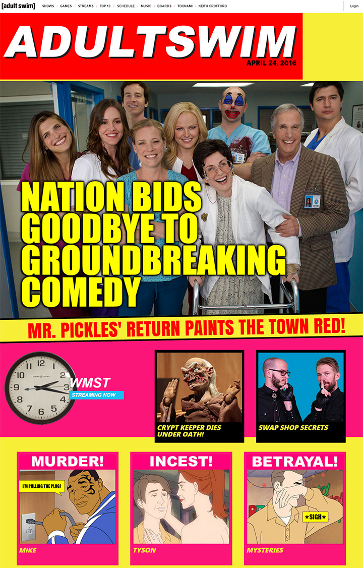
Adult Swim is known for adult humor but with a younger crowd. Their target audience knows how to use the Internet and can appreciate the wackiness of the layout. This particular design really fits the crazy atmosphere that Adult Swim portrays on television.
I feel this is a great example of branding across two media platforms. Their website has the same feeling as their television block and the programming that runs on it. The design also contrasts greatly against the more conservative design of FOX’s website.
Each network or production studio will need to find its own branding. The unique style of a brand is what makes it stand out from everything else. Learning how to brand a company is much more detailed than the scope of this article, but I will suggest reading about identity design and brand marketing to get started.
The TV network websites used in this article are great for drawing inspiration. But it’s also nice to see a full list of different examples collected together in a showcase.
So if you’re in need of some network or studio website inspiration, this gallery is guaranteed to set you on the right track.
Jaime is a jr. designer interested in mobile UI/UX research and frontend web development with JavaScript frameworks. He covers general news and useful resources in the web design space.