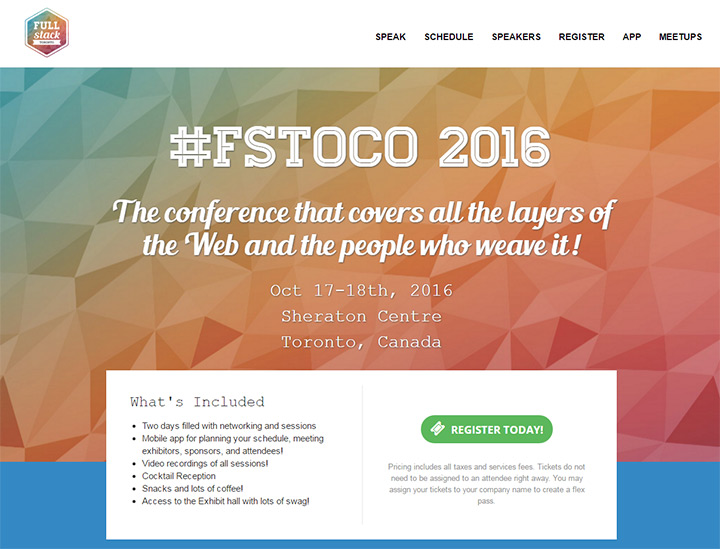
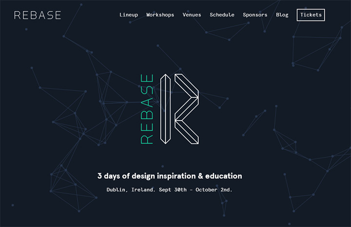
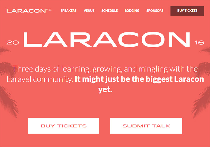
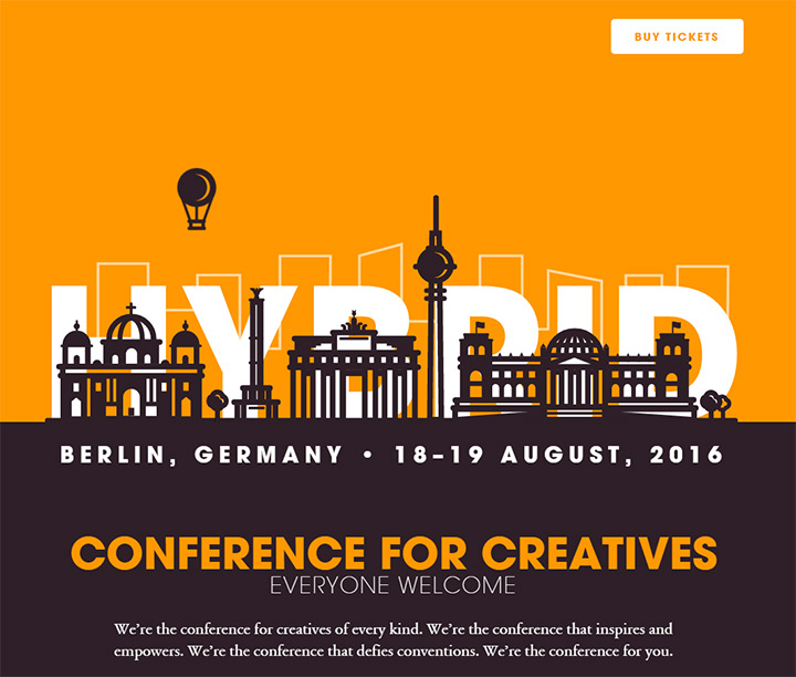
Meetups and professional conferences have grown into every possible industry around the world. The Internet makes it much easier for people to connect and attend these conferences. But without a quality website and a streamlined user experience, conferences can suffer a poor online image and fewer ticket sales.
I’ll offer a handful of practical tips for conference & event websites that can be applied to any theme or style.
The goal of a conference website is two-fold:
With a focus on these two areas you can design any style, any theme, any layout structure and still build a following. Of course, the quality of the event itself is still a big factor in ticket sales.
But a great website helps paint the picture of a great event, which naturally drives buzz around the watercooler and improves ticket sales over time.
The #1 pet peeve I have with bad conference web design is lack of immediate information. Some visitors already know what a conference is about and where it’s held. However many, many visitors do not know any of this.
Conference websites are not the final product. They’re a means to an end; and that end is the physical event. Every event has a place(even if it’s remote) and a time.
Be sure to include the physical location and event date(s) above the fold in plain view. If someone really wants to attend an event but can’t find the venue or location they’ll eventually leave in frustration.
Imagine someone ready to snatch up a ticket, but so frustrated with the lack of easily-accessible information that they just give up and move on with their day. Not a good outcome.
I’ve placed this tip first in the article for good reason. People don’t want to traverse conference websites for fun. It’s the website’s job to present as much vital information as possible right to the user’s line of sight.
The website for ConveyUX has an example that’s hard to miss. Two big sections fixed above-the-fold are dedicated to when and where, both labeled appropriately.
You can even click these two green blocks to get further info about lodging and the conference agenda.
Since the conference name includes the term UX, most visitors can assume this event involves user experience design. But there’s even a tagline under the title for clarity’s sake.
Another live example can be found on Facebook’s F8 website. There’s event info plastered across the header along with a registration button. When the F8 event kicks off the webmaster removes the register text and instead links the button to a live stream online for people who can’t make it in person.
If you scroll down a bit you’ll find more information regarding the event details, also labeled as where and when. These are two very specific terms which everyone can understand. They’re even more relevant on event websites because each site is only a marketing platform for a physical gathering.
You’ll also notice the big button coercing visitors to learn more about F8. The event name is rather confusing so there’s not much you can assume, other than Facebook is running the event.
Place yourself in the shoes of an average visitor and consider how they’d feel landing on your event website. Give them all the info they need upfront and offer links to further pages if they’re curious to learn more.
The Lead Developer Conference has a brilliant event landing page. Content gets straight to the point. It’s a conference for development leads & dev experts. It’s in London, June 23rd-24th 2016.
There’s also a “buy tickets” CTA in clear view. Some visitors already know they want to get tickets and this button makes their task much easier.
If you’re not sure what kind of information you should place in clear view, here’s a quick list to consider:
By the phrase “event details” I mean very specific information about the event’s activities, speakers, lodging, and/or group events like games or afterparties.
Write content to inform visitors clearly so they understand what the conference is about, what attendees will get from the experience, and what type of activities they might expect.
When writing copy try to follow this advice: avoid vague sentences. Buzzwords are popular in marketing but they don’t say much. You want to write tangible, digestible sentences that offer true insight into the event.
My favorite example of great writing can be found on the Day of REST website. The name seems vague but the tagline clears it up quickly.
It generally breaks down to: learn about the WordPress REST API from the people building it. So this conference is probably full of keynotes and presentations, maybe some workshops, all focused on the WordPress REST API.
We also have a date(Jan 28, 2016) and location(Conway Hall in London). Could the conference runners have included more info? Certainly.
But the homepage content is enough to clarify confusion with just enough details to get people digging further.
The website for EnhanceConf features its own detailed tagline. It reads:
EnhanceConf is a one day, single track conference covering the state of the art in progressive enhancement.
This gets right to the point and covers the event’s topic with a link for folks who don’t know about progressive enhancement.
And while this sentence is great, I have to criticize the EnhanceConf website for not providing any information about this year’s event. It’s probably because the 2016 event doesn’t have a date or location yet. But I’d still expect some info like “Date: TBD” just so that visitors aren’t left in limbo.
Now let’s take a look at some bad web copy on the Create Upstate homepage. Before I cover this example let me say I am in no way criticizing the conference itself. My critiques are solely about the website experience, both as a web designer and a visitor who has no background on this conference.
You’ll notice there is a date and location plastered in the side navigation bar. That’s great, and it’s right above the “register” button for ticket sales.
But the homepage doesn’t explain anything specific about this conference. Here’s the only descriptive statement on the homepage:
Create Upstate is a design conference unlike any other, bringing together Upstate NY and beyond in a celebration of design and community.
In my opinion this is an example of vague copy. Create Upstate describes itself as “a design conference unlike any other”. Why? In what way(s) is it unique? What are we celebrating? Is it a party, or am I sitting through presentations? Both? Neither?
Even worse is that the primary side navigation doesn’t contain a link for more details. There is an about page in the site footer but you’d really need to visit the schedule page to find specific details.
Your homepage details don’t need to be the length of a dissertation or even multiple paragraphs. The details should be just long enough to explain why people might go to the event, with a focus on specificity over vague platitudes.
Design your layout with the user experience in mind. This is good advice for every website, but the specifics differ based on your target audience and their intended goals.
Consider the needs and desires of a typical visitor. Think about how they might flow through the page, where they might click, and how they might navigate content.
What are visitors looking for when visiting event websites? I don’t have all the answers, but here are some questions I ask myself when visiting an event page.
This info doesn’t all need to be crammed onto the homepage. But if a visitor has any of these questions it should be obvious where they can go to find answers.
Mobile World Congress uses bright colors to draw attention to their navbar. The very first link reads “start here” with a dropdown of links for when & where, what to expect, and the conference agenda. It doesn’t get much simpler than this.
The overall design also feels very professional and crisp. Content is organized in a way that you know exactly where to find what you’re looking for.
Mobile World Congress is one of the biggest events for this industry, so it’s natural that their website would reflect this status. But I must commend the designers on how well everything flows, specifically the content dropdowns and text labels.
It can be tough placing yourself in the headspace of a typical visitor. If you already know so much about a conference, how can you understand what it’s like for someone who doesn’t know anything? This is where user testing becomes valuable so you can gauge your UX decisions accordingly.
Thinking Digital Conference has a slightly different UX methodology but it works just as well.
Their homepage has everything I’ve been talking about: date, location, and a brief tagline. But the kicker is their guiding link text “so, is this for you?” which auto-scrolls further down the page.
If you keep scrolling you’ll find links to previous talks and further info regarding this two-day conference of workshops, dinners, and parties.
Smaller conferences need to handle their UX differently than larger conferences. But every conference/event website needs a simplified user experience with the aim of helping visitors answer their own questions, and maybe even take some action.
An event page with no distinct CTA can be off-putting or just plain confusing. Let’s quickly clarify the purpose of a call to action and how it should work.
CTAs can be buttons, links, forms, or anything that drives a user to perform a predetermined action. Event websites want to sell tickets, inform new visitors, and maybe allow sponsors & speakers to get in touch to offer their services.
Most visitors to these websites expect the CTA to lead into details about the event. I suggest having different CTAs located at different points in the site. The most important tends to be a ticket/registration button.
What does a missing CTA feel like on a live website? Check out the Thought Bubble site for an example.
Note this isn’t a jab against the website or the conference. I do think their website is useable and their slideshow offers great information. But there’s no vibrant button or link with the aim of shepherding me to perform an action.
The slideshow has three slides: one with event info, one for volunteer signups, and another with a link to Facebook. None of these seem like crucial actions, nor would they apply to most visitors.
Links for tickets and info can be found right in the navigation. That’s great and certainly to be expected. But conference designs should be more visceral. Potential actions should be obvious right from the start.
Without a CTA guiding to the tickets page or guiding to a page with more event information, I feel a little lost on Thought Bubble’s website.
Now let’s compare Thought Bubble’s design to OpenVis Conf. Nav links are still noticeable but the two bright pink buttons are much more noticeable.
All details are visible above the fold but my attention is drawn towards these two clear actions: one for the calendar of planned events, the other for purchasing tickets.
Not all CTAs will be valuable to every visitor. But they should bring attention to the actions that you want visitors to take. Most event organizers would agree they want to sell more tickets. OpenVis’ website does an excellent job of illustrating the power and potential of well-designed call to action buttons.
From Business To Buttons is another big conference with very clear CTAs on the homepage. Notice the use of bright colors and alternating designs between the filled button and the ghost button.
Asymmetry is a powerful design tool. You can bring attention to page elements that seem a little different because they stand out against other areas on the page. The Business to Buttons team naturally wants to sell tickets. But they also link to a recap video which explains the event with visuals rather than written words.
While tickets and event details are the two primary CTAs for conferences, they aren’t the only choices.
EmberConf places an e-mail signup form on the homepage to keep people in the loop for next year’s EmberConf event.
Since the current year’s event is already over, there’s no reason to have people buying tickets. But there’s plenty of reason to keep people informed about next year’s event so interested parties will know when tickets go on sale.
E-mail lists are powerful marketing tools for direct communication with a particular audience. If your event has the potential to build a large readership I recommend adding an e-mail signup to the homepage.
Regardless of how you design the CTA or where it’s placed on the page, you should always consider what you want visitors to do when first landing on the website. This will differ based on the type of conference, so experiment and learn which actions gather the most conversions.
Events occur in the real world with real people. This doesn’t translate well on a digital screen, so videos and photos are the best methods to capture the mood and emotion of a conference.
Visitors love to see photos because it gives them something to expect. It shows previous venues, stages, speakers, audience members, and captures a certain atmosphere which can be somewhat interpreted digitally.
Try to add relevant high-quality photos to the homepage and to other pages when useful. Professional photos help visitors connect with the event, realizing that it’s not just a website but a real gathering of real people. I know it’s crazy to think that people wouldn’t understand this. But visuals help sell the event as a real tangible experience away from the computer screen.
The Next Web actually started as a conference before moving into web publishing. They’ve had years to hone their website and to capture photos of a captivated audience.
Right after landing on TNW Europe you’ll find all the necessary stuff like date, location, and ticket registration. But their design has a lifelike feeling with the hero image background photo(high quality too).
Scroll a bit further and you’ll notice a photo gallery from past events. These photos vary from closeups to action shots and presentations on the event stage.
Internal pages also use relevant hero images, like the shot of Amsterdam on their hotels webpage. So photos can be used to spruce up your content and improve page aesthetics.
UX London is another big event with a background photo slapped onto the homepage. It shows an aerial shot of the venue from the previous year’s event with many different people wandering around the conference hall.
If you scroll down you’ll see that individual content areas are broken up vertically with two columns. The right column contains a photo while the left column has relevant content.
This pattern is consistent across the entire homepage and gives visitors a peek at the conference before even attending. I don’t think this layout style is worth replicating across the board, however it works brilliantly for the UX London website.
But I’m even more impressed by the UX Sofia website. The homepage header alone features all the cornerstones of a great conference website design.
You’ll find other photos on the page for scheduled speakers, plus other header images applied to internal pages like workshops and the event seminar.
UX Sofia does not have a perfect website. But the site does a lot of things right, and just browsing through the site for information should help you think about how content & visuals should be organized on your own event website.
Branding is crucial for every event. It builds subconscious recognition and helps the event scale to a wider audience. Even the smallest events can grow into something big. Presentations, activities, and conference environment all play a role in an event’s success or failure.
But you should never overlook the power of branding, both in physical material like banners/merchandise and digital material like websites and social accounts.
Take a look at the homepage for Smashing Conference hosted by the infamous Smashing Magazine. Their world-renowned “S” logo is in the favicon and the page logo. Their design also incorporates the Smashing Cat mascot among other vector icons representing staff members.
Smashing Conf runs in multiple cities every year so this one website is home to information about each conference location.
Branding connects across the entire site and brings a feeling of liveliness. The logo and mascot vectors definitely add to this vitality.
I highly recommend designing a logo that’s catchy and recognizable for your event website. Sometimes this needs to be made from scratch like the Business To Buttons circle icon.
But other times you can work with existing logos & mascots like EmberConf for Ember.js and CakeFest for CakePHP.
One thing I don’t like about the CakeFest website is the cloned logo. While it is recognizable, it’s basically a direct copy from the CakePHP website with no alterations. This logo is easy to recognize so it works fine in this scenario.
But it’s always a good idea to alter existing logos to blend into conference websites. This way you have a custom brand for the original product/company, plus an alternate brand for the conference.
When it comes to identity don’t sweat it too much. Over time conferences have a way of adapting and growing into a life of their own. If you’re working to create a new event webpage, focus on UX first.
Just don’t forget the importance of branding and the role it can play in growing a new conference.
Website themes can be anything from generic minimalism to exceptionally detailed skeuomorphism. Themes can also relate to web copy(funny, serious, techie) or the manner white space is utilized to organize page content.
By designing with a theme you bring consistency to the interface. Users like websites that are easy to learn, and thematic websites create patterns for visitors to pick up. Unique design elements can play a big role, both for aesthetics and marketing purposes.
This doesn’t mean you need incredible graphics if they don’t fit with the event. But you should learn how to create a mood & emotion with a webpage by trying to replicate the emotion of the conference itself.
GitHub’s newest conference GitHub Satellite is a wonderful example of a thematic design. The site mixes grayscale with colorful gradients for contrasting effects. The logo gives off a very “outer space” theme blending nicely into the conference name.
This is part of the GitHub Universe conference which has a similar landing page. Social links, newsletter signup, date+location and powerful branding.
GitHub is a big company so they know good design. There’s a lot to learn by studying sites like these if you’re looking to solve specific problems(ie. navigation, web copy, typography, etc.)
My favorite conference theme is the 2015 dConstruct webpage. It has a Jestons-esque layout with lots of futuristic vector illustrations and grainy background textures. Even the logo text and the tickets link both blend into the futuristic theme.
dConstruct 2015 covered topics related to “designing for the future”. This tagline makes sense and explains the mood, tone, and atmosphere of their 2015 conference website.
I don’t want to imply that you need illustration skills and powerful design aesthetics to sell a conference. Not all conference sites are like this, and sometimes photos are more powerful than digital graphics.
But there’s something to be said about the atmosphere on dConstruct’s website. So if you have ideas for custom graphics that could fit into a theme then it’s worth going that route.
Circles Conference uses cheesy yet nostalgic graphics replicating the ‘80s and ‘90s graphic design scene. This theme uses bright patterns, shapes, geometry, and graphics that seem like non sequiturs compared to each other.
This is another extreme example but it gets the point across well.
When designing a conference or event website you should pick a theme and stick to it. Whether it’s black and white typography or a layout filled with 80s design aesthetics, make sure it all meshes nicely with the conference’s mood and tone.
If you’re not sure what to do try contacting the event coordinators and brainstorm a few ideas. Some events want to appear more professional, others more creative. Some want a laid-back attitude while others want to appear structured and orderly.
Find your theme and find a way to blend it in with all the UX tips from this article. If you can do that I guarantee you’ll end up with a conference website that performs well and looks good too.
This post wouldn’t be complete without some inspiration for conference web designers. Creative ideas often come from the combination of your own unique thoughts plus new ideas you gather from other designs.
I’ve collected 50 conference websites that I believe exhibit quality UX design traits. Whether you’re looking for inspiration or just want to browse some conference website designs, this gallery is sure to provide everything you need.
