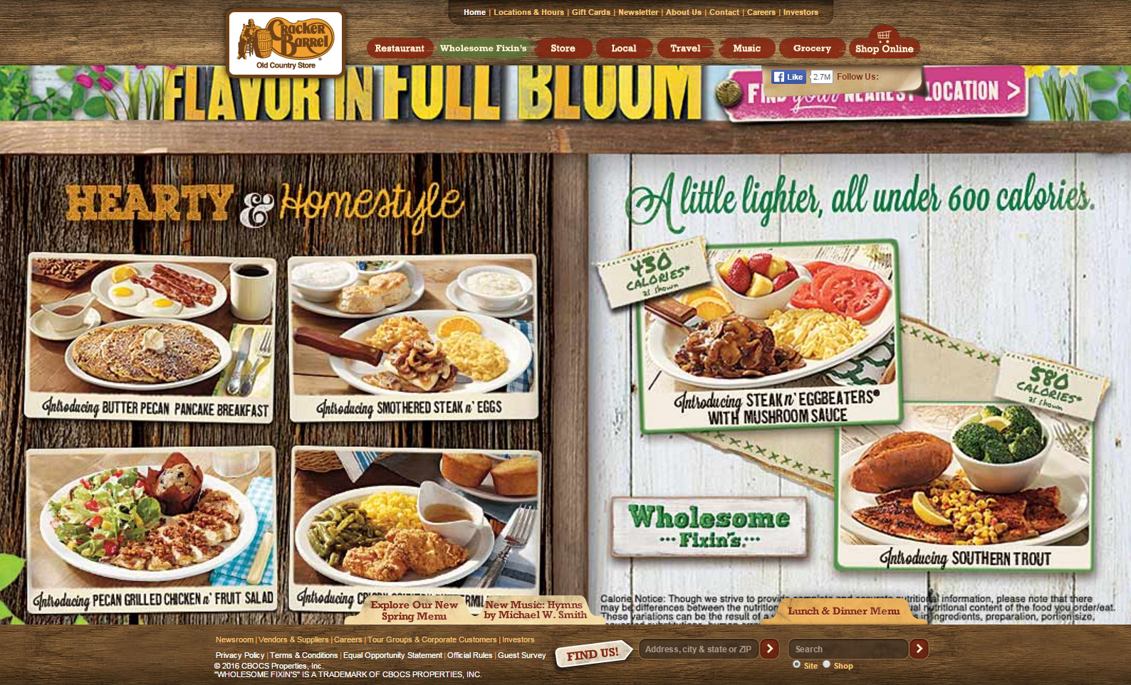
The old time country store Cracker Barrel quietly launched a new website design in Q4 2015. It features many old-timey elements with a rustic feel reminiscent of the era it represents.
Looking over the homepage it’s much easier to browse with larger photos and typography. The design uses many photo textures like wood backgrounds, chalkboards, and worn paper effects. Going the route of realistic textures opens the risk of looking cheesy but I think Cracker Barrel pulls it off well.
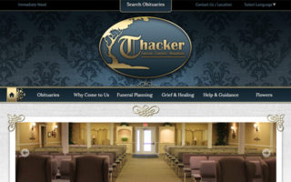
Here’s a comparison of the new design followed by the old design. Click either thumbnail for a fullsize screenshot.

Some visitors may not like the change, but you can’t please everyone. However from my perspective the new design really is a dramatic improvement sporting a much a cleaner user experience.
Yes the textures add a certain ambiance to the layout. And yes the typographic effects pile onto this rustic aesthetic.
But the new Cracker Barrel website just feels so much nicer to use, regardless of pretty design elements.
Dropdown menus are smooth and their store locator page works just as you’d expect. I also really like the new menu page with organized framed photos and a worn paper backdrop for good measure.
Visit the new site for yourself and see what you think(for comparison the old design can be found on the Internet Archive).
And if you’re a Cracker Barrel patron be sure to give your regards the next time you stop by for a meal.
Jaime is a jr. designer interested in mobile UI/UX research and frontend web development with JavaScript frameworks. He covers general news and useful resources in the web design space.