The more we learn about web design, the further we get away from the “brochure-ware” sites of the past. We now know a website can be a huge marketing tool for our clients’ businesses, and we’d be doing them a disservice by providing them with any less.
So why, then, do so many designers get landing pages wrong? In my opinion it breaks down into two things:
A landing page has one single purpose: to be as persuasive as humanly possible in order to get conversions. So anything that we include on the page that doesn’t drive that conversion is likely to sabotage it.
First, Let’s Define a “Landing Page”.
A lot of clients and designers get this wrong and confuse landing pages with a homepage, or some other page within the site.
For all intents and purposes a landing page as we know it in 2016 is a free-standing page that has one single offer or message. In turn, it should only have one goal — to get people to act.
Now that we understand the purpose of a landing page, let’s look at five of the most common mistakes designers make when crafting landing pages and how to avoid them so we can deliver real value to our client’s web projects.
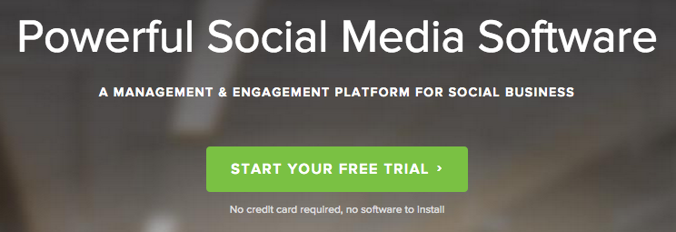
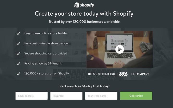
Since the goal of every landing page is to drive conversions, it makes sense that the call-to-action is the most important element on the page. And it should be treated that way both in hierarchy and visual weight.
All too often designers shy away from attention-grabbing CTA buttons. I guess they’re afraid of designing anything that might look jarring or out-of-place. But a high-performing CTA button is not the place for subtlety.
Does that mean it has to look garish or distasteful? Not at all. It simply has to stand out amongst its surroundings. Here are a few tips for CTA buttons that convert:
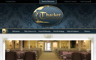
A good self-contained landing page should not encourage visitors to leave without converting. So by using navigation elements, such as a header bar or even contextual links, you are stealing focus away from the goal of the page.
Ditch the concept that a landing page must fit into the ecosystem of the rest of your client’s website. You should include just enough content within the landing page itself to entice visitors to convert without needing to wander aimlessly on their own.
While your landing page design should offer enough information to be persuasive, any extra could have the opposite effect. Writing for the web is an art form unto itself and is best left to those who know how to do it effectively.
Hopefully your client can afford copywriting services. The words on a landing page can actually be more important than the design itself(sorry fellow designers).
But if they’re providing the copy themselves, watch your client’s back and look out for a few things:
Since the purpose of a landing page is to persuade viewers to take action, you don’t want to leave out the most persuasive element of all — social proof. Social proof can come in any number of packages but it all boils down to trust.
Human beings are wired to avoid risk. So before we can make any kind of commitment, we like to look for indicators that tell us “it’s okay. You can trust these guys.”
Think about the last time you ordered anything online or ate at a restaurant without checking a few reviews first. It’s been a while right?
You want to do business with the known rather than the unknown. If somebody else has already tried it, you want to hear from them that it’s worth your money.
One of the best ways to infuse a bit of trust in a landing page is to simply add a testimonial or two. But remember, not all testimonials are created equal. Here are a few tips for testimonials that will have users clicking through like crazy:

Remember as the web professional it’s your job to tell your clients what they should include on their landing pages. If they haven’t thought about testimonials, tell them why they are so important and forward the above advice so they can find the best testimonial subjects.
Knowing what we know now about user behavior, image sliders should be permanently banned. I understand the thinking behind them. “If this message doesn’t appeal to a user, maybe this next one will.”
But a landing page should have one single message rendering the image slider completely irrelevant.
If your client has more than one offer or message, each should get its own landing page with its own content to support it.
A tightly designed landing page can boost your clients’ conversions while adding to their bottom line.
The key is to keep it on point, be persuasive, and make the call-to-action extremely clear.
By adding extra design elements your client may feel like they’re getting more bang for their buck. Yet in reality it’s the opposite.
By focusing on the content and the simplicity of the message you can really earn your money not only as a web designer, but as a web professional. It’s this kind of additional value that allows you to justify charging more with future clients.
Wes is a web designer in Chicago. When not working with clients, he enjoys keeping up-to-date on all the latest in web design, usability and internet marketing. He regularly shares this knowledge through blogging and in his podcast The Deeply Graphic DesignCast.